Colour after Covid - The 2023 Dulux Colour Forecast
It’s my favourite time of year - the Dulux Colour Forecast - and I’ve done a deep dive. Ready? Grab a drink and a snack and let’s go!
All images are styled by Bree Leech and photographed by Lisa Cohen for Dulux NZ & Dulux Australia.

Walls in Dulux Ōkārito, door in Dulux Ashburton, striped wall in Dulux Herd Street and Dulux Breezy Half.
Colour Forecasting and styling: Bree Leech, Photography: Lisa Cohen
It’s hard to believe that we’re almost two years into the “post-covid” world. Not, of course, that we’re actually “post” anything but there was very clearly the “before” and we’re now well into the thick of the “after” - a world where mask wearing, social distancing and staying home if you have even a hint of sickness is the norm. But aside from the more medical aspects, so many other parts of life have changed and, actually, many for the better. It feels like we’re more aware than ever of how we want to live and we know how to make it happen. We recognise what was causing us stress and we’re more committed to making changes that help us to enjoy life (in theory anyway!).

Walls in Dulux Spectacle Lake and ceiling in Dulux Manorburn Quarter.
Colour Forecasting and styling: Bree Leech, Photography: Lisa Cohen
For many of us, we have more freedom about where, when and even how we work, we know the pleasure that comes from cooking a good meal at home, or meeting a friend for a walk with a coffee rather than always trying to find a seat at a crowded cafe, and when we do eat out we want it to be something special. We’ve realised how we can better maintain relationships - even when we can’t see them often, and that in turn has given us greater flexibility with how (and where) we live our lives. I see it as a shift to quality over quantity - be it how we spend our time, money, energy and even love.

Ceiling and walls in Dulux Remuera, Feature wall in Dulux St Bathans, Beams in Dulux Gentle Annie.
Colour Forecasting and styling: Bree Leech, Photography: Lisa Cohen
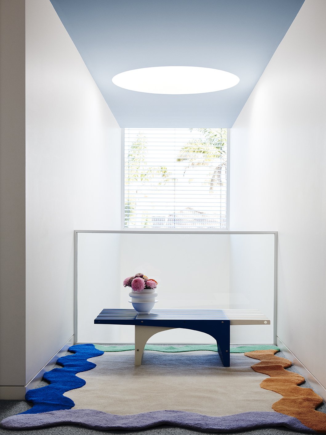
Our homes are still the focus of our individual worlds, as they have been since that first lockdown. But whereas we were previously looking for them to multi function as workplace/classroom/calming bunker/home restaurant and everything in between, we now find ourselves with a bit more freedom and a new knowledge of what really matters to us. It’s an exciting place for a trend forecast to launch from, and it’s exactly what the Dulux Colour Forecast 2023 explores with their three palettes, Connect, Balance and Revive.
I’m going to share the images and my personal thoughts around each of these palettes, each thoughtfully curated after months of research by the Dulux team who look globally to design trends as well as examining the bigger picture. There is something in here for everyone and I’d love to know what palette resonates with you the most and why.
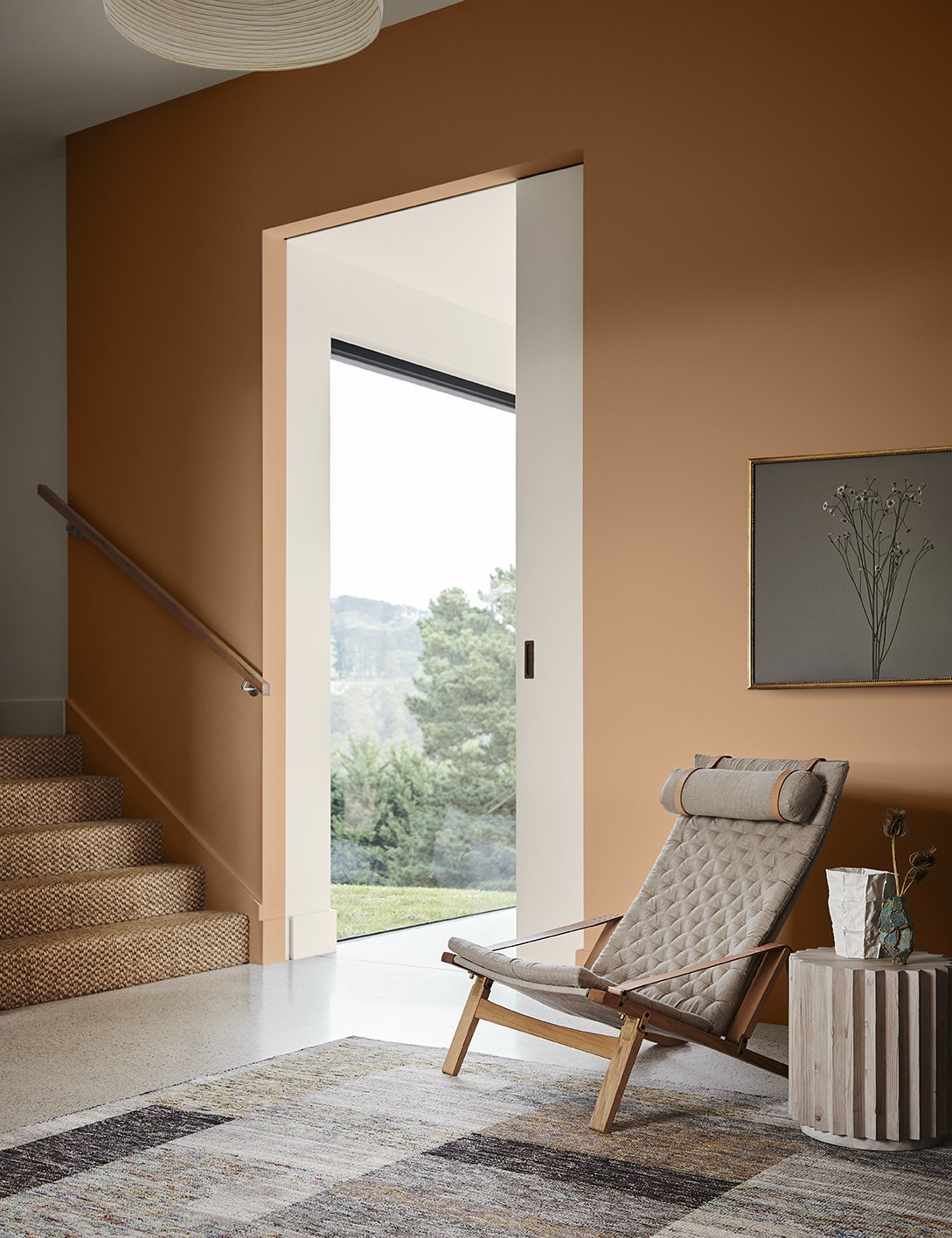
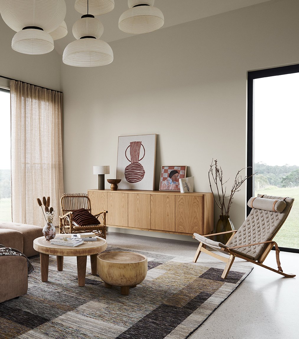
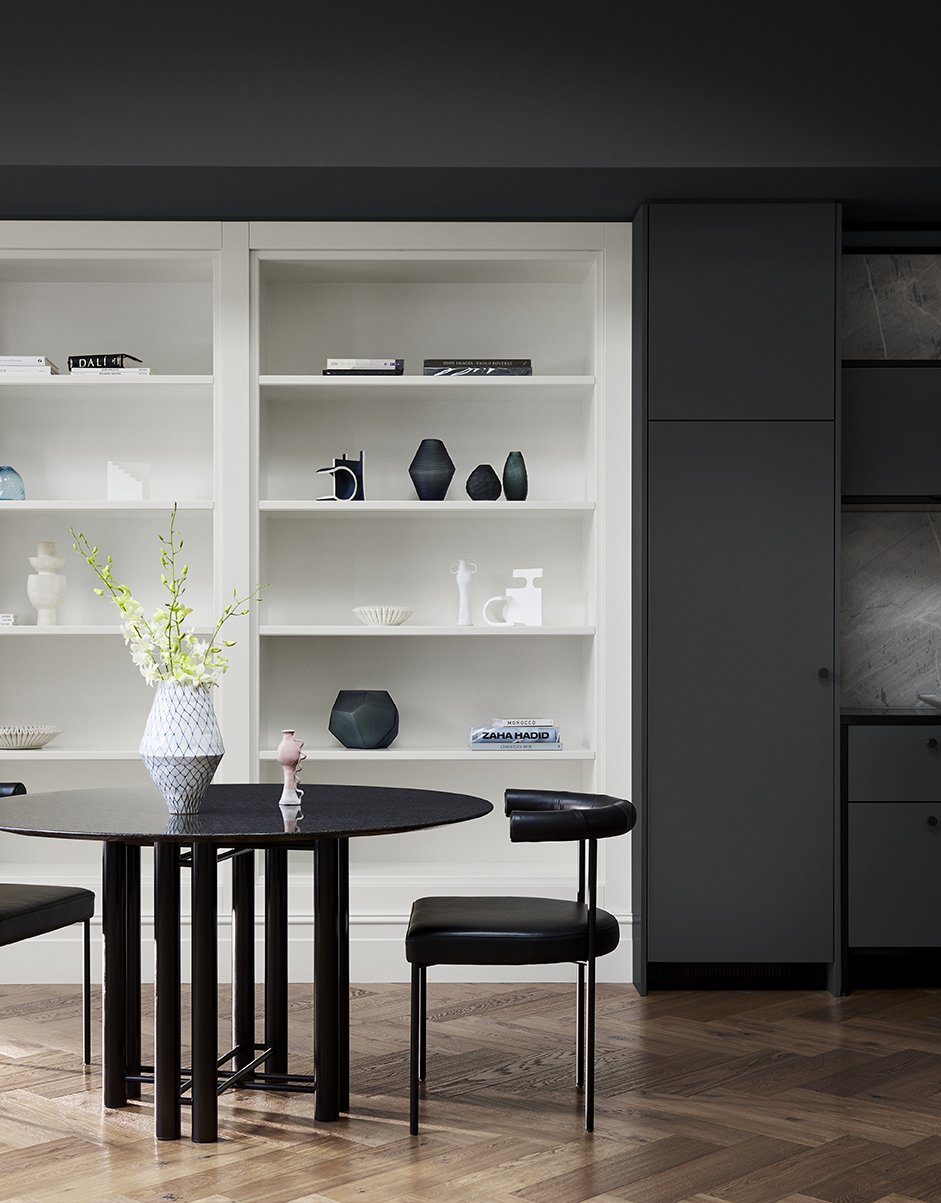
Connect

Walls and ceiling in Dulux Remuera.
Colour Forecasting and styling: Bree Leech, Photography: Lisa Cohen

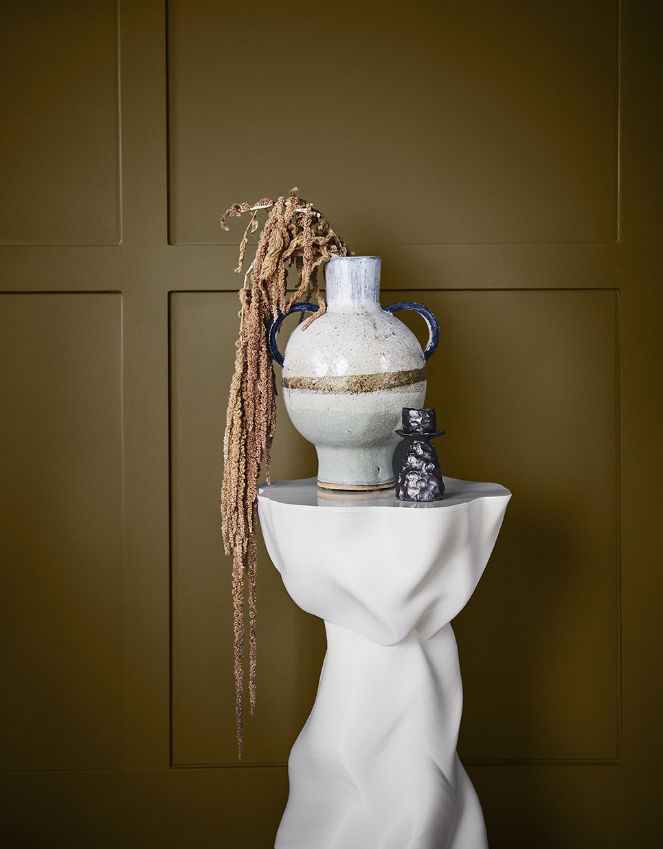
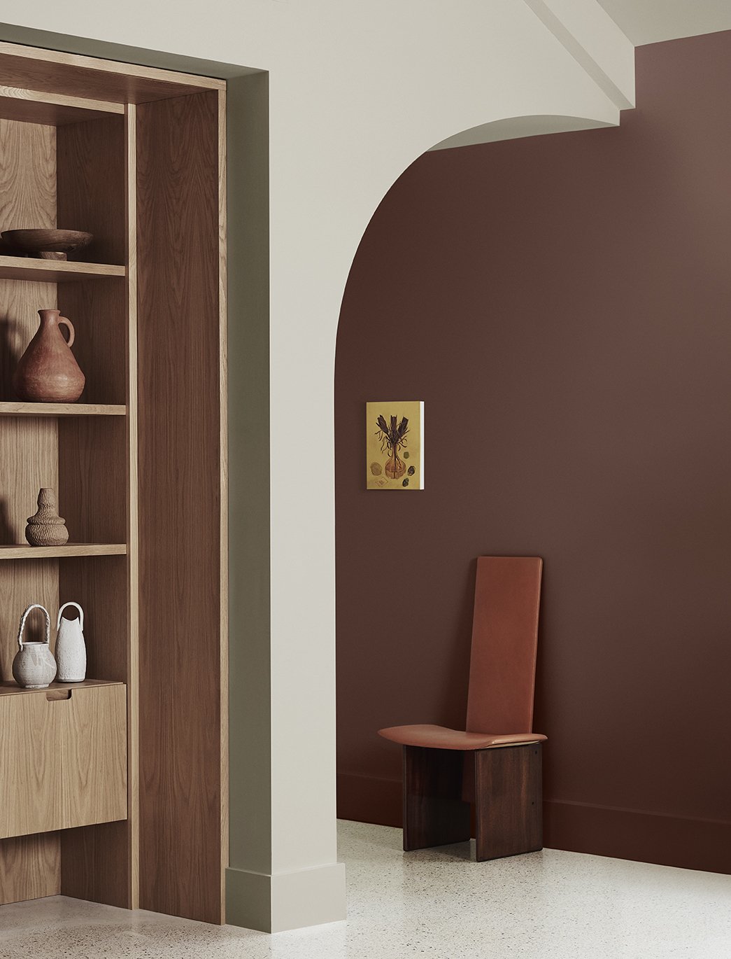
Connect is technically the most neutral of the 2023 palette, but it’s really not very neutral at all. Instead, earthy, natural-pigment inspired tones of sandstone, iron, blackened timber and swampy greens create a strong, grounded palette that reflects the reality of nature. We’re given a spectacular rawness in place of the idealised “nature” based palettes of clean, bright greens, petal pinks and soft tans that we’ve grown used to.
I found it so interesting hearing Dulux Colour Expert Davina Harper talk about the impact of our awareness of climate change on these colours. We’re past the point of pretending that our planet isn’t in danger and finally we’re making it part of the conversation. I love how this palette reflects that, while still taking inspiration and joy from nature it also forces us to get our hands dirty. Alongside these colours we see natural materials but again, in a more raw form - rustic ceramics, aged wood, vintage textiles. Connect is about colours and materials that connect us to nature in a conscious way.

Walls and ceiling in Dulux Research.
Colour Forecasting and styling: Bree Leech, Photography: Lisa Cohen
My personal favourite colour from this palette is Dulux ‘Research’ - a deep olive, yellow green - infinitely swampy and yet sophisticated

Ceiling and walls in Dulux Remuera, Feature wall in Dulux St Bathans, Beams in Dulux Gentle Annie.
Colour Forecasting and styling: Bree Leech, Photography: Lisa Cohen

Walls and ceiling in Dulux Mt Inaccessible.
Colour Forecasting and styling: Bree Leech, Photography: Lisa Cohen
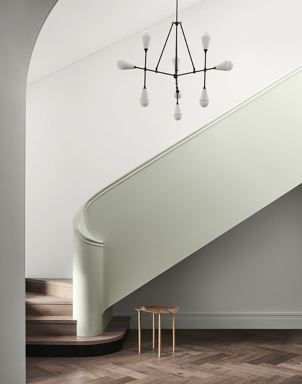
Balance

Walls in Dulux Pure Blue Half and Dulux Kimberley Sea.
Colour Forecasting and styling: Bree Leech, Photography: Lisa Cohen

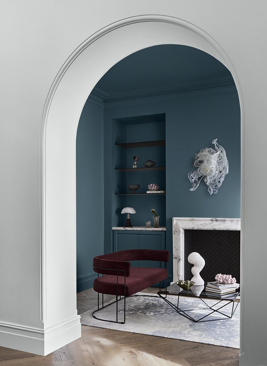
The second palette, Balance, is a real reaction to the topsy turvy of the last two years - with a calming ocean inspired array of colours - blues and teals, shell pinks, and a solid balance between light and dark, and warm and cool. I am fascinated by the theory that the Balance palette is based upon - that structure in nature is intrinsically comforting - think organic patterns like the marks left on the sand by the waves, or the swirl of a shell. The knowledge that there is structure holding everything together creates a sense of security and safety, something many of us are still craving as we wonder what might be thrown at us next.

Walls and Ceiling in Dulux Dunedin.
Colour Forecasting and styling: Bree Leech, Photography: Lisa Cohen
I find it really interesting to see how this palette uses very dark colours like Dulux Rāwene, and bold colours like Dulux Deep Garnet to add real depth to this colour story. I feel like it shares a language with the Connect palette in how it interprets nature, no longer just picking out the “pretty bits” but taking the dark with the light and using the strong contrasts found in nature as inspiration.
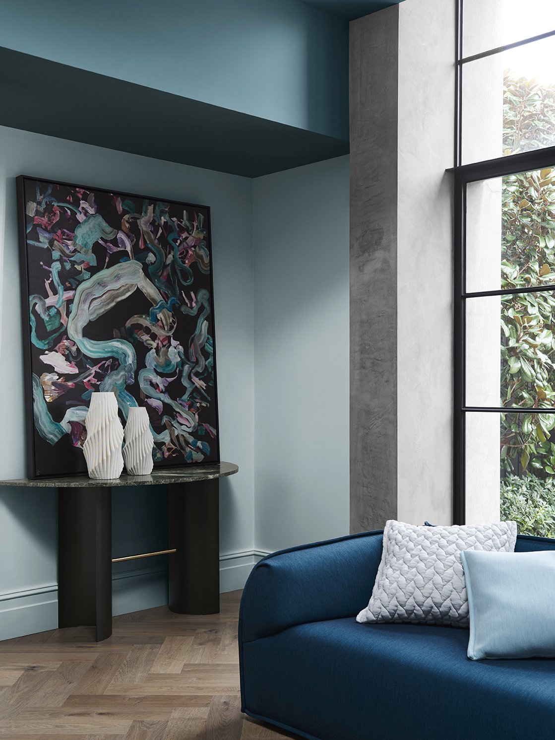
I especially love the teals in the Balance palette - Dulux Port Jackson, and Dulux Kimberley Sea - in the unexpectedly brilliant combination with Dulux Deep Garnet. They’re really rich jewels of colour. That richness follows through with the materials and shapes of the Balance palette - opulent, textural fabrics like velvet and silk and intricate patterning with a focus on curving organic shapes.

Wall in Dulux Ruahine, bulkhead in Dulux Kimberley Sea.
Colour Forecasting and styling: Bree Leech, Photography: Lisa Cohen

Walls in Dulux Manorburn Quarter and Moana Reserve Half.
Colour Forecasting and styling: Bree Leech, Photography: Lisa Cohen
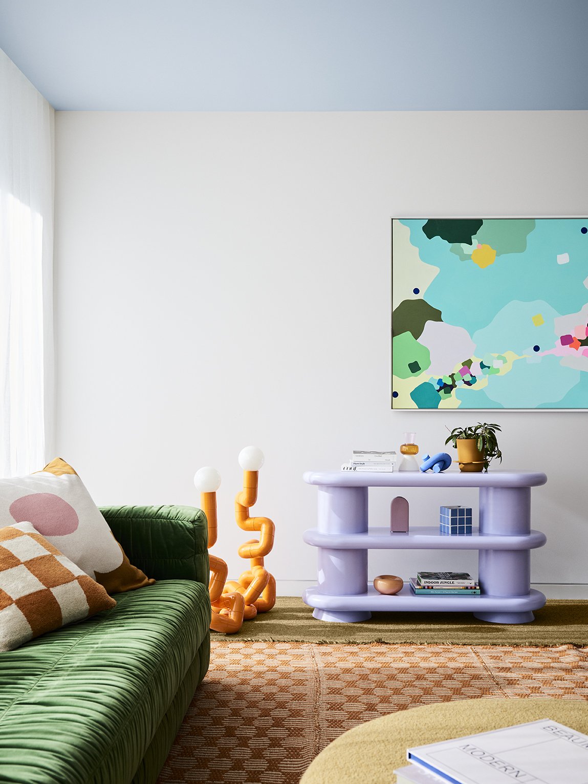
Revive

Walls in Dulux Ōkārito, ceiling in Dulux Tūrangi, Feature walls in Dulux Sergeants Hill and Dulux Tata Beach.
Colour Forecasting and styling: Bree Leech, Photography: Lisa Cohen

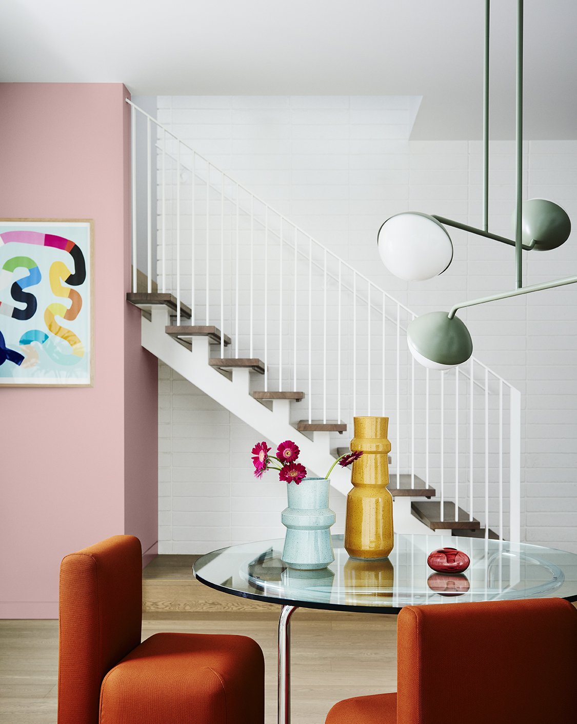
Revive is the fun one, a palette of sheer optimism that branches across the spectrum in a combination of pastels and more jewel tones. I see Revive as the more grown-up sister to the pastel aesthetic we’ve been seeing a lot over the last couple of years. While it still has a strong 80’s vibe it is much more contemporary in how it combines sherberty shades with some serious zing (like Dulux Purple Celebration).
There is a real “devil may care” attitude with this palette, which when tied back to the world we now live in comes from a place of seizing the day, and choosing to live and play with colour in a way that is utterly joyful (and you know I’m all about that!).

Wall in Dulux Diorite and ceiling in Dulux Pharoah’s Gem.
Colour Forecasting and styling: Bree Leech, Photography: Lisa Cohen
The shapes and materials associated with the Revive palette echo these sentiments - they’re playful, chunky, even almost cartoonish. The colour combinations verge on discordant and that’s what makes them so damn energising. There’s also a real move towards colour blocking and colour features - taking these “pow!” colours and almost creating an art piece with them within light and bright interiors.
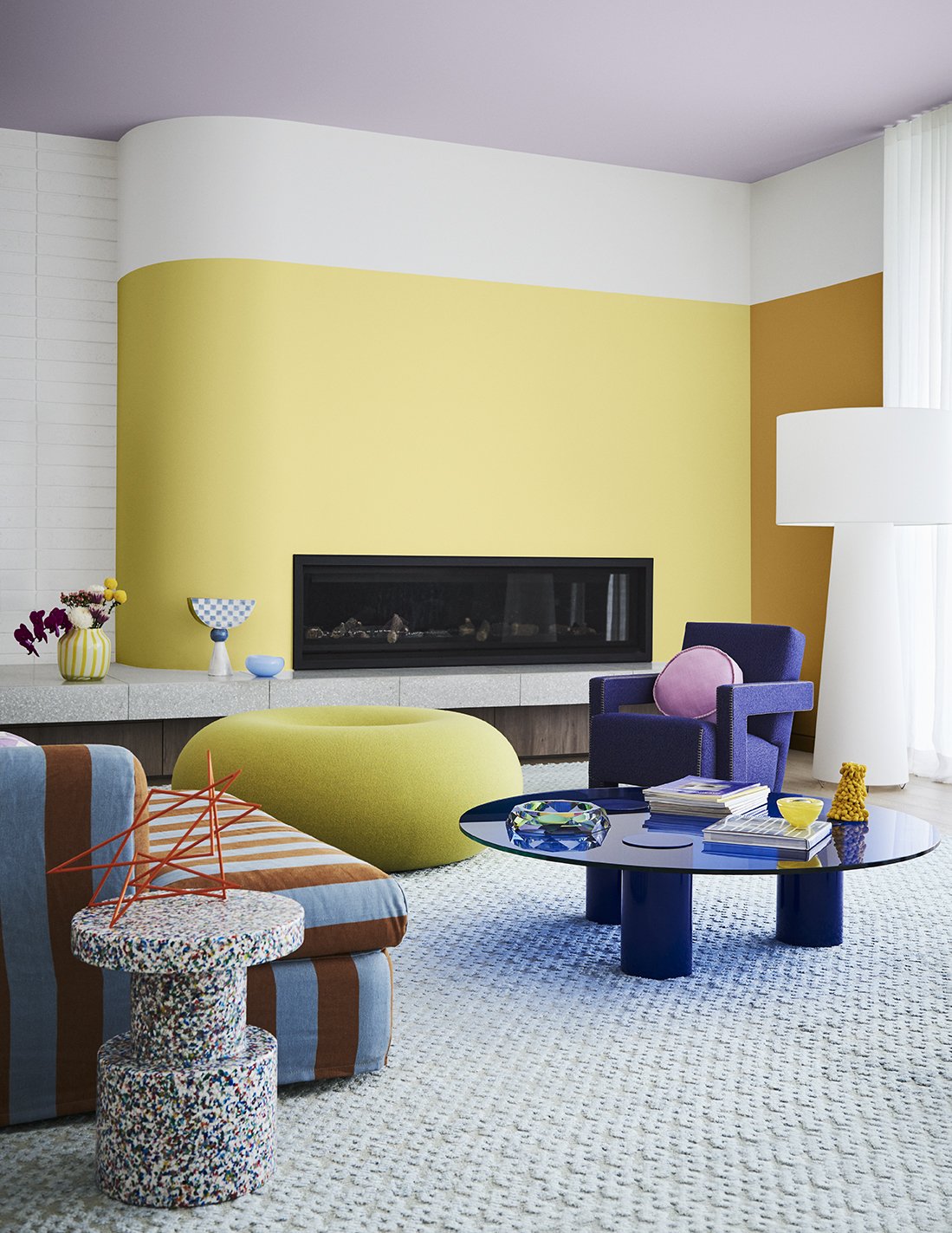
I feel like this is the palette with the most hidden depths, and that beyond its fun exterior there’s a lot more to unpack, but my initial instincts are being drawn to absolute all out colours of Dulux Tata Beach and I can’t get over that ceiling in Dulux Purple Celebration (below, so good right?!).

Ceiling in Dulux Purple Celebration, walls in Dulux Ōkārito.
Colour Forecasting and styling: Bree Leech, Photography: Lisa Cohen

Walls in Dulux Ōkārito, ceiling in Dulux Breezy Half.
Colour Forecasting and styling: Bree Leech, Photography: Lisa Cohen
If you’d like to learn more about any of the palettes - visit the Dulux site, where you can also order free paint samples or buy test pots of your favourite colours to give a go! If you do have painting plans I’d LOVE to know!
While I’ve done my best to accurately label colours used in the images - please check the Dulux website before ordering. All images included in this post were styled by the incredible Bree Leech and photographed by the amazing Lisa Cohen for Dulux NZ and Australia.
Evie x
I am Dulux NZ Colour ambassador but all thoughts shared are my own. You can check out more of my work with Dulux here.