Winter 2020 Colour Trends With Dulux - The Indulge Palette
Somehow here in the Southern Hemisphere we’ve found ourselves in Winter. It’s a weird one, considering we’ve spent most of 2020 in lockdown - predominantly indoors, to have our freedom back only for short, cold days and a hankering for home. I think many of us have been given a new appreciation of what these four walls really mean to us and how our environment really impacts us.
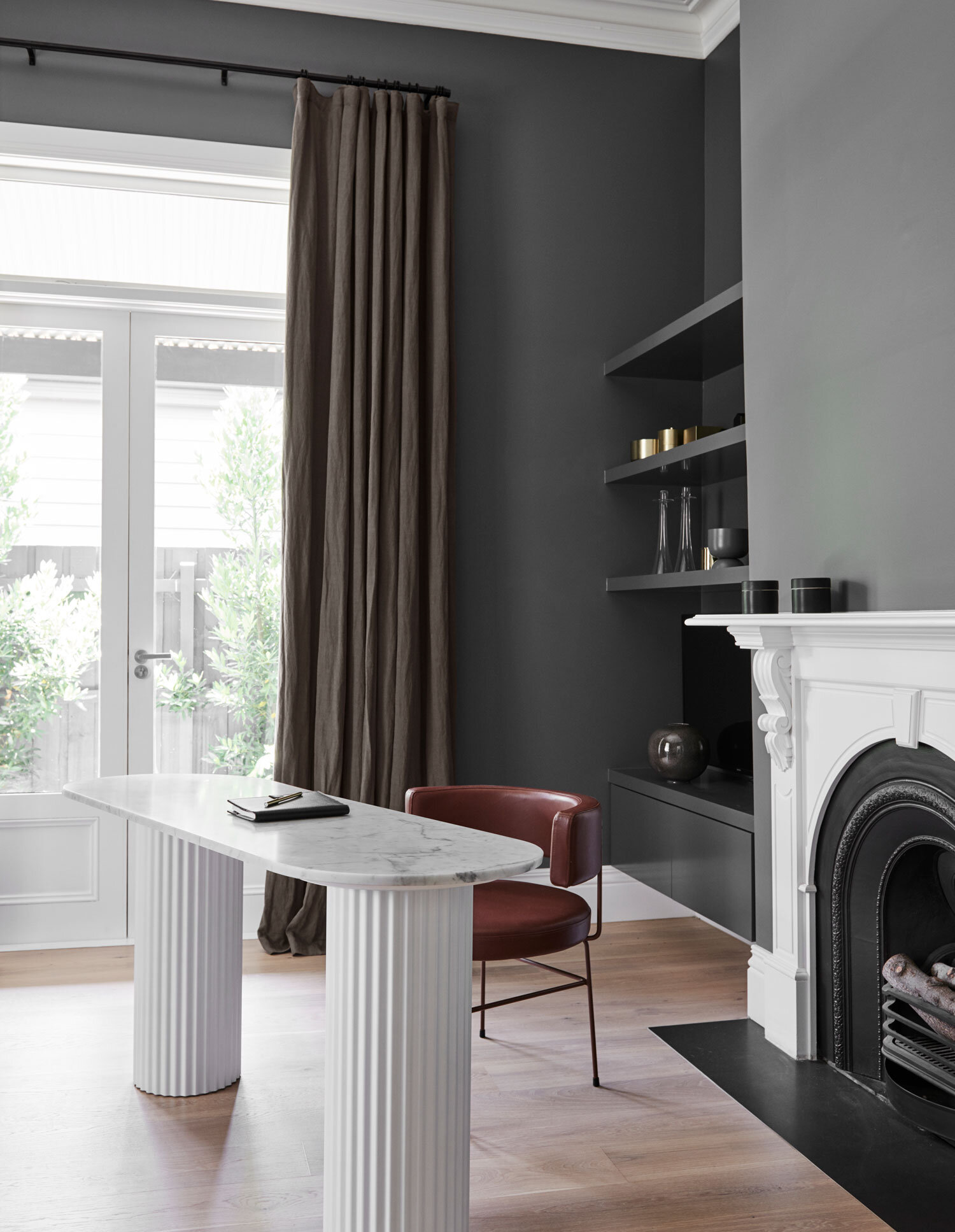
The Dulux 2020 Winter Trends “Indulge” Palette as part of the “Essence” colour forecast. STYLIST: BREE LEECH. PHOTOGRAPHER: LISA COHEN. COLOURS: DULUX® WASH&WEAR® IN RUSSET TAN, CARDRONA. . ARTWORK: “STILL LIFE WITH DIANTHUS AND BEE” BY DENA KHAN.
The winter colour trends are always my favourite, to study and share. These colder months are when home, and particularly colour really come in to their own. Never underestimate the impact the right colour can have on your mood, especially if you’re someone susceptible to SAD (seasonal affective disorder) . A rosy glow through a window as you return home in the dark is a comfort and a cozy scheme in the living room always makes it seem warmer than it really is (this is something I have tested having painted my living room a warm mustard - Dulux Manaia - and it always feels cozy now…I think even the dogs are fooled).
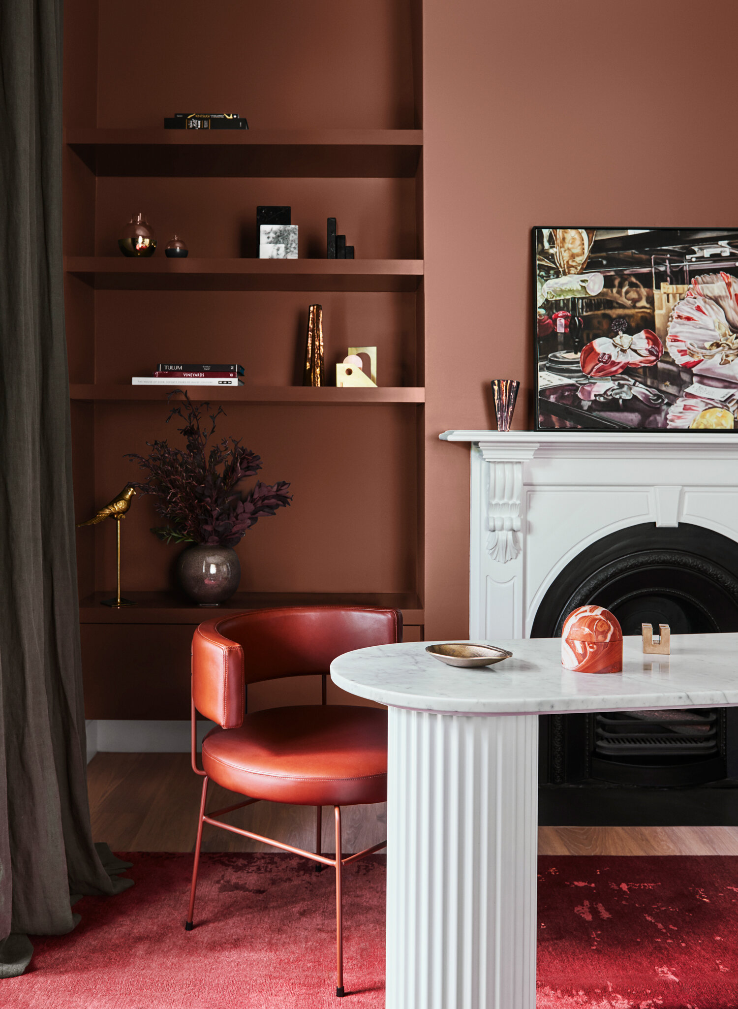
A before and after using Dulux Russet Tan in place of the previous grey, brings a warm sophistication that really shows off the existing pieces in the room. STYLIST: BREE LEECH. PHOTOGRAPHER: LISA COHEN. COLOURS: DULUX® WASH&WEAR® IN RUSSET TAN, CARDRONA. ARTWORK: “STILL LIFE WITH DIANTHUS AND BEE” BY DENA KHAN.
The Dulux Indulge palette (one of the four main palettes from the Dulux 2020 Colour Forecast “Essence”) embodies this nurturing, cocoon-like approach to decorating. Dominated by (my personal favourite) Russet Tan with rich berries, and touches of lilac and muted mustard, it’s like a mulled wine in your favourite bar with a side of chips with truffle aioli (we can do that now too!). I love the boldness of this, as for a couple of years now we’ve seen brown increasingly flirted with mostly in soft mushroomy tones and classic oatmeal. It’s such a rich and varied colour and i’m excited to see it explored in a starring role. When it comes to deep, rich colours we’ve been reliant on charcoals and navy’s for a really long time, and as a resolutely warm-colour addict it’s cool (warm?) to see such chocolatey shades setting the tone.


“The study nook in the child’s room was better suited to a lighter palette. I replaced the cool white on the walls with Dulux Wash&Wear in Subtle Violet – a gentle shade that added warmth without overpowering the space…I gave the chair a quick update by giving it a lick of Dulux Aquanamel paint in Trentham and by adding a pretty pink cushion. Fresh flowers, touches of gold and some pink and violet glass pieces reinforced the feminine palette,” says Leech.
STYLIST: BREE LEECH. PHOTOGRAPHER: LISA COHEN. COLOURS: COLOURS: DULUX® WASH&WEAR® IN SUBTLE VIOLET AND CHAIR IN SOUTHERN APLS; AND DULUX AQUANAMEL IN TRENTHAM. ARTWORK: “MORE THAN WE COULD KNOW” BY KATE DAMBACH, MODERN TIMES.
Dulux designer Bree Leech, gave these two rooms a makeover using the Indulge palette to really show how it it changes a space and the depth you can achieve just by adding colour. I think it’s really important to note the use of the colours Trentham and Subtle Violet to bring a real softness and warmth in a sophisticated way. While not as bold as the Russet Tan they share that velvety luxeness that really envelopes a space in a way cooler tones often can’t.
“There are different ways to interpret this look – if you’re feeling bold, go dark and dramatic with saturated shades of burgundy and eggplant. Or, for a softer look, opt for soft grey-violet or calico. The key is to choose a hero colour and display it in different shades across your walls and soft furnishings, with one or two contrasting accents to provide that element of surprise. ”
Davina Harper, colour expert at Dulux explains that the Indulge palette is influenced by both the 1970’s and Art Deco, and considering the richness of these eras is key to it’s success. Think smooth curves, luxe textures, a mixture of styles, and thoughtful lighting to make your space really sing, it might not be for the faint hearted but executed with conviction I reckon it’s sure to lower your blood pressure a bit as you cozy up!

The full “Indulge” palette from Dulux for Winter 2020. My mum recently used the colour “Broadway” in her kitchen makeover and it’s gorgeous! I’m eyeing up “Kelburn” for my own home.
I’ve gathered a few extra pictures inspired by these Winter colour trends, and if you’d like to see more and the wider selection of colours click here!

Room by Laurence Simoncini, Photographed by Romain Ricard for Elle Decor France.
“People are often cautious about experimenting with bold colours, but there’s no need to be. Statement colours can be incredibly effective – and chances are, once you start experimenting with them in your home, you’ll never want to go back to a blank canvas,” says Harper. “Paint is such a versatile decorating tool – if you change your mind down the track you can easily switch it out.”

Room by Laurence Simoncini, Photographed by Romain Ricard for Elle Decor France.

“The Home” apartment by Ferm Living, photographed and featured on These Four Walls

“The Home” apartment by Ferm Living, photographed and featured on These Four Walls

“The Home” apartment by Ferm Living, photographed and featured on These Four Walls

Pieter Estersohn via Apartment Therapy

Yet another from Ferm Living
This post is part of my ongoing partnership with Dulux NZ in my role as Dulux Colour Ambassador, all thoughts and food analogies are my own.