Essence: The Dulux 2020 Colour Forecast
Today the Dulux Colour Forecast for 2020 was announced. A culmination of months of research, work, decision making, and styling to create a framework for what we can expect in the NZ and Australian interiors world in the next year, and (just as importantly) why.

“With more focus on mental health, the wellness movement continues to gain momentum, as does an emphasis on natural materiality.” - Davina Harper, Dulux NZ
The Dulux Colour Forecast is special in that it isn’t telling us what trends to follow but rather explores major themes occurring in design, what these are and why we’re seeing them. It offers a guideline of colours, textures, shapes and objects we’ll almost inevitably be drawn to and looks more closely at why that is. The emotional element of colour is integral to how we see and experience the world and I love how the forecast puts this under the microscope.

Styling by Bree Leech, Photographer Lisa Cohen.
‘Essence’ is the thoughtful name given to the latest Colour Forecast.
“The Dulux Colour Forecast 2020 provides an opportunity to reflect and re-energise whereby we can tune back into the essence of what matters to us. This year, it is expressed through four tonal palettes that are nature-inspired, comprising soft comforting neutrals which have rich, invigorating accent hues that allow moments of personal expression. ”


The influence of nature and natural materials on these palettes is really strong, and even through the blue and green tones there is a natural warmth that flows through. At a time when, in many ways, the world is increasingly cold and hostile with a terrifying international political climate it tallies that we return to our roots, and the comfort of the natural world and the solidity that offers us. Similarly, there is much less overt cultural inspiration than we have seen in previous years, really bringing it back to, well, the essence of home.
Big, bold, loud colours have been pared back to be softer and more harmonious, tonal schemes are the new clash. In furniture and objects we see an emphasis on the handmade, the antique, the familiar. It’s less about the shock, and more about a richness that speaks to our soul.

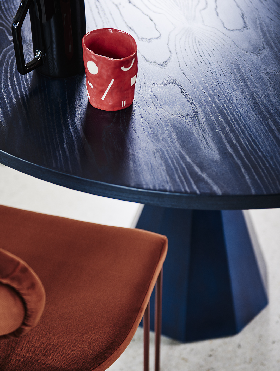
The first of the four palettes within ‘Essence’ is ‘Comeback’.
Comeback is the new vintage, a sophisticated palette with colourful nods to creative eras past. Soft, beautiful blues paired intercepted with rich russet, mustard, deep blue and teal bring to mind a palette that wouldn’t be out of place at Charleston, the famous home of The Bloomsbury group, but given a modern twist. This is the palette with the most contrast and an instinctive eclecticism bringing classic pieces and colours together in a fresh, modern way. This is a palette I see emerging in my own work, the pairing of super fresh blues with warm, cozy hues is a clear winter sky outside the window while the fire roars inside.
I’m particularly besotted with the colour “Mt Maunganui” - a milky tea, that is a warm, rich alternative to whites or greys .
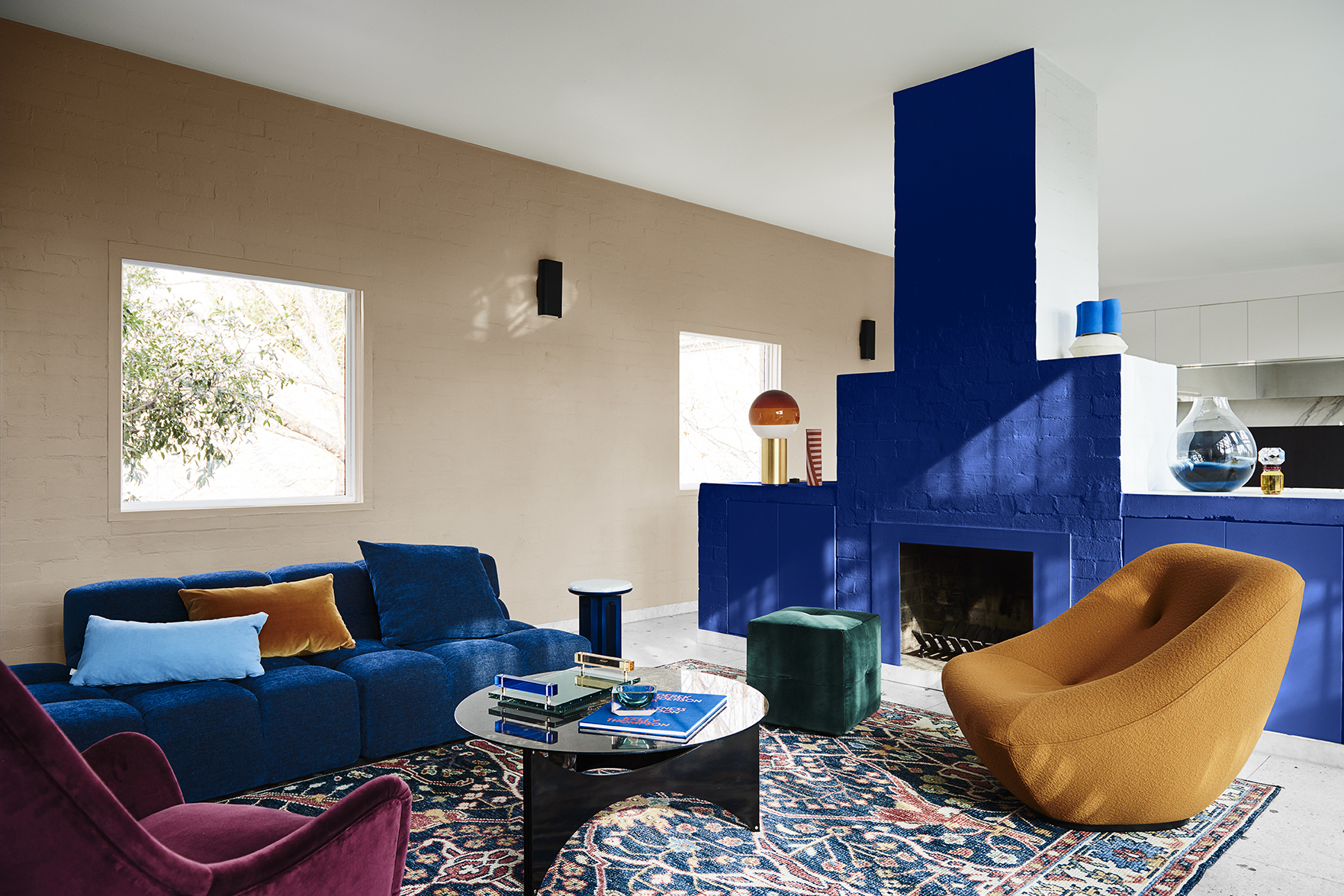
Styling by Bree Leech, Photographer Lisa Cohen.
Wall (rear) in Dulux Mt Maunganui, Fireplace sides and ceiling in Dulux Southern Alps, Fireplace in Dulux Master Blue.

Next up is ‘Cultivate’. I’ve talked a lot about the influence of nature and this palette is where it is most evident - obviously, it’s almost entirely made up greens of almost every kind, with punches of lichen yellow, and rich plum. Our relationship with nature and it’s effect on our wellbeing (also known as biophilia! Look it up, it’s fascinating) is the inspiration for this collection. This is the palette that has the strongest sense of “home” to me, reminding me of our childhood home that was painted largely in shades very similar to ‘Tauherenikau’ - a sage green, from the walls to the kitchen cupboards, even the floor which my Mum had painstakingly handpainted tiles. Perhaps because I spent the first 14 years of life in a calming (5 kids ha) cloud of chalky greens and blues, it’s also a palette I’ve never really explored in my own design but I’m feeling it, especially toned in with the rimu ceilings we have at home.

Styling by Bree Leech, Photographer Lisa Cohen.
Wall in Dulux Pencarrow (left), wall in Te Aroha (right).
‘Peering In (Canopy)’ Original artwork by Clare Brodie, Studio Gallery Melbourne;

Styling by Bree Leech, Photographer Lisa Cohen.
Ehnicraft Oak Burung Storage Cupboard, Trit House; Japanese Ceramic Bowl Large in Green, Safari Living; Archie Pot in Emerald Terrazzo (stand only), Capra Designs.
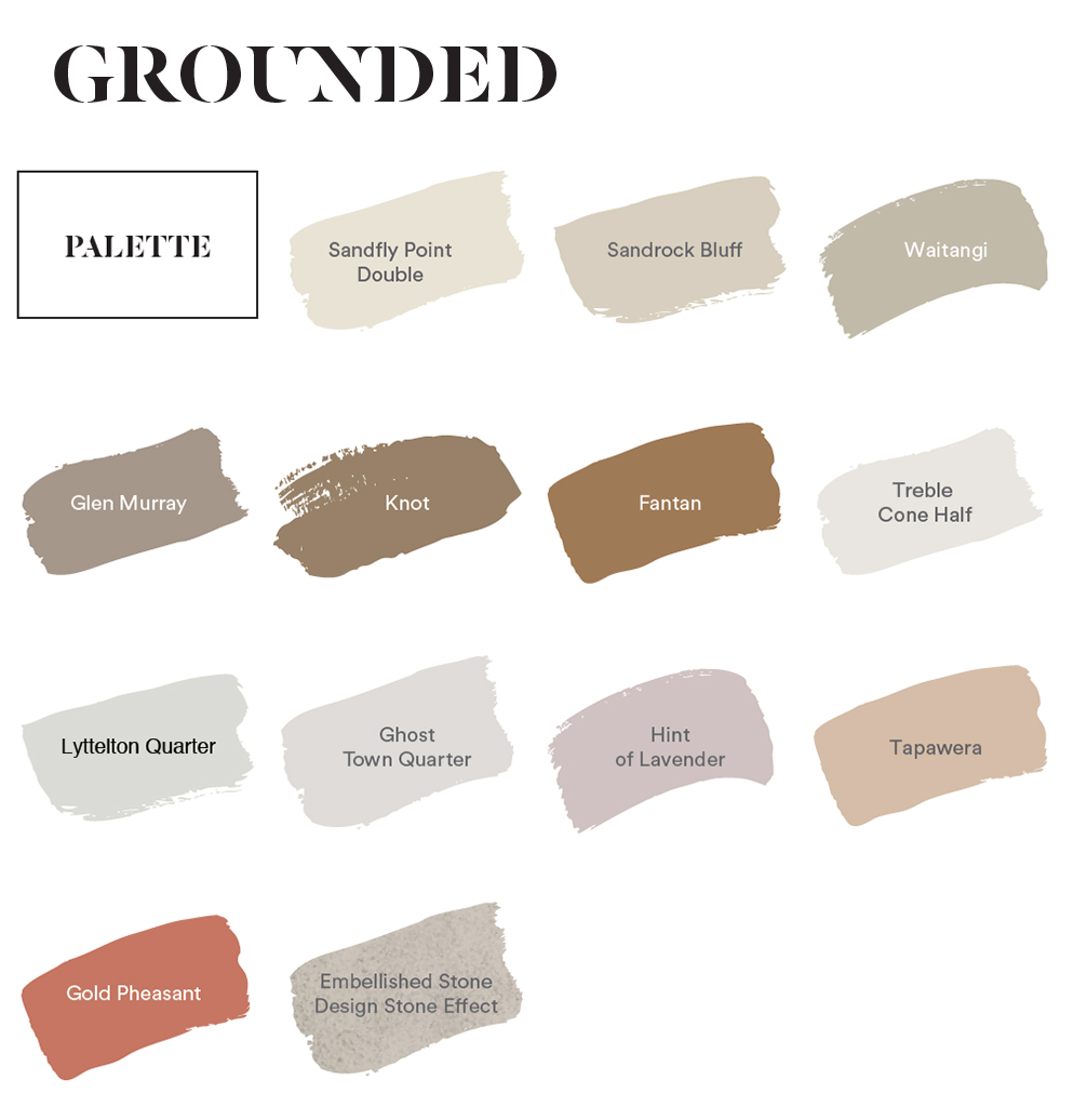
‘Grounded’ is the new luxury. The most neutral of the four palettes but an incredibly rich and warm palette. As soon as I saw this palette I thought of a beautiful carved soapstone bowl I have from NZ brand Asili with the splashes of coral with swirls of palest tan, clay and mauve. We’re moving really far away from clinical “whiteness” in light interiors and looking to natural materials to bring that sophisticated edge to the new neutrals, honouring craftsmanship and bringing warmth and narrative to even those most understated spaces. It feels like it has taken us a while to figure out this “pale and beautiful” thing, turning to harsh “scandi inspired” styles against entirely stark walls, when this textured, rich, multi toned really gets to the heart of creating a light, airy space with genuinely great vibes.
I see materials like travertine, natural sheepskin, and beautiful white NZ clay as the inspiration for this palette and I’ve got to say I love it. In terms of excitement, this is what I’m most looking forward to seeing having the biggest influence over the next year or so.

Styling by Bree Leech, Photographer Lisa Cohen.
Wall in Dulux Waitangi, wall in Dulux Sandfly Point Double (right)
Artwork: White Desert - Egypt by Chris Sisarich, Maker’s Mkt;

Styling by Bree Leech, Photographer Lisa Cohen.

So obviously, ‘Indulge’ was always going to be my personal favourite - in fact, I love it so much I secretly hope that if anyone ever saw my aura it would pretty much be this palette. ‘Indulge’ is about an escape from the day to day, inspired by travel and the rich eras of the 70s and Art Deco, it’s a combination of luxe, super warm tones paired with furniture and textiles that are speaking that same language - curvy, retro, delicious. This palette is not about perfection, quite the opposite - it’s that squishy, old, velvet couch with Grandma’s original 1970’s curtains and zinger of a colour on the wall. It’s “gimme shelter” on the stereo and the most fabulous toasties and champagne party you’ve ever been to (ok, I’m making this a thing).
While ‘indulge’ is undeniably bold, like it’s fellow palettes it has a warmth that underpins everything and brings us back to that idea of home as a retreat and a refuge.

Styling by Bree Leech, Photographer Lisa Cohen.
Wall in Dulux Henna Red
Artwork on wall: Lilac Moon IV, original print by Ellie Malin, Modern Times

Styling by Bree Leech, Photographer Lisa Cohen.

In addition to the 4 main palettes, Dulux has also collated ‘Dulux Highlights’ - a mini selection of 4 super brights to bring an extra pop in to any of the palettes. I’m really excited about this addition, it’s those quirky, unexpected moments that make a design and really make it your own. Consider using these for accessories and furniture too. A ‘Manapouri’ blue coffee table is going to go with ANYTHING.
“Trends can be a useful roadmap when choosing colours, but it’s those little touches of the unexpected that give your home personality.”
So, that’s the 2020 Dulux Colour Forecast, if you’d like to see and learn more head to the Dulux website - where you can also order testpots or grab a few free large size swatches if you’re feeling inspired to paint.
I’d love to know what you think of the forecast this year, what are you favourites? What surprised you? What are you feeling most inspired by?
Part of my ongoing partnership with Dulux as a Dulux Colour Ambassador