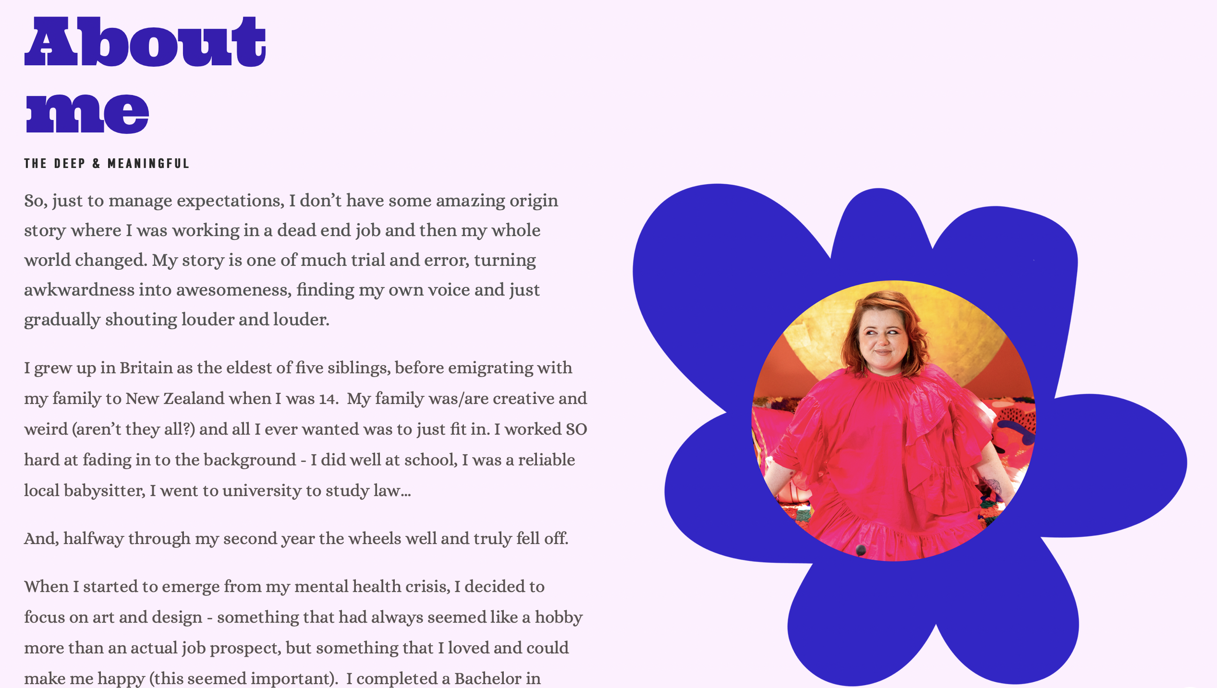
How to design a multi-hyphenate Squarespace site

If you haven’t visited for a while, you might have noticed my website has had a bit of a makeover!
This is a paid post with Squarespace as part of my role as a Squarespace Ambassador.
When you’re a multi-hyphenate creative - trying to fit all the different aspects of what you do onto one website AND make it clear, easy to navigate and not miss anything out can seem super daunting. In the past we really had to choose a web platform based on a single functionality - was your primary focus to share your portfolio, or to sell products, or to blog? It was frustrating and it really played into the idea that to be successful you had to niche down, whereas now, in 2023, we’re seeing so many creatives and business owners sharing their multi-faceted skills and interests.

I’ve used Squarespace for the last 6+ years, through various evolutions of my business, and rather than having to pick and choose what I offer I’m able to easily bring them all together through my Squarespace website. In my latest redesign I wanted to start from scratch to really make use of all the functionality Squarespace has to offer and to showcase my (very varied) work in a clear, concise and balanced way! It was really important to me that while I showed that I do art, design, interiors, styling and everything in between - that I didn’t let one aspect hog the spotlight because that’s not how I work. However, I did want it all to feel cohesive and show how I can weave all those different strands in to my work. But I also didn’t want visitors to have to trawl through loads of pages to get what I do - because that’s just now how we use websites. Easy right?
You can have a good look around my site to see how I’ve done this but I thought I’d share a few key points…
“I’m the creative version of a one-woman band. Across art, design, and interiors I create visual symphonies, and immersive, joy-filled, creative experiences. ”
Make that first paragraph really count.
I’d love to think that everyone who visits my site spends hours reading every single bit of it, but I know that’s unlikely. If you’re a multi-hyphenate creative it’s more important than ever that your introduction is short, snappy and truly communicates what you do. This can be hard and I found it really helpful to outsource to friends who do similar work to write short descriptions of what they think I do - I then used those to craft my final introduction.

Speaking of making things easy…
Take advantage of functions like contact forms and scheduling to cut down admin and streamline the process of working with you. My “Work with me” form asks a few key questions that help me reply more fully and know if I’m the right person for the job. Use it wisely and keep it simple - I ask for a deadline (because if it’s next week then we know it’s not going to work!), a budget and a short description of the type of work.
For my interior design consults I have a more involved questionnaire that gathers a lot of the info needed before the consultation - automating the process means that we can get straight down to the fun stuff!
A picture speaks a thousand words.
A cliche, but it’s true! Don’t tell people what you do - show them. I found I could split most of my work in to three broad groups “Art and Design”, “Interiors and Styling” and “Collaborations/brand representation”. Then under those umbrellas I created portfolio pages with an overview and lots of yummy images. You can see how all the work is linked together even across different projects and it communicates a lot in a short period of time.
Don’t make people jump through hoops.
If it’s too hard to find out how to contact you - people just won’t. I have a link to my “work with me” contact form on almost every page. It might seem unnecessary or repetitive to you when you’re working on your site and looking at every page but keep in mind, many visitors may only click on to a single page - make it easy for them.

My work enquiry form that just gets a few basic details.
Know what your audience is looking for.
Use your site analytics to know where your visitors are mostly heading to and make it super simple for them to find. Make sure key pages (such as your shop link, and contact page) are always linked in your navigation menu, and it doesn’t hurt to add extra links in your website footer too. Be sure to toggle between viewing your website on phone and desktop to see how your menu appears in both. DON’T hide your search bar and do make sure to use tags on posts, images and products.

My homepage GIF is totally weird but really expresses everything I do and what you can expect from me and my work.
Share your personality.
I get very drawn in by beautiful websites I see but ultimately you have to find your own style, that expresses who you are and fits with the work you’re showcasing. I look for Squarespace templates that fit my energy level (eg not the minimalistic, serene ones) and work from there. My website is based on the Sonora template that had lots of space for a wide variety of imagery.
As well as visually, make sure your text communicates in your own (or your brand) voice - don’t feel forced in to overly corporate speak if you’re an independent artist, it is incredibly jarring…and well, a bit weird.
Don’t forget community building.
This is my own goal for this year - to create newsletter content that lights up inboxes and to encourage my community to sign up and join me there. I also recommend including the instagram block on your homepage - it creates a changing piece of content even when you haven’t had time to update your site by sharing and refreshing your latest instagram tiles. Put your social links in a prominent position and prompt your visitors to give you a follow!

Be generous.
If people are taking the time to visit, it’s nice to give them a little something back - have content on your website that inspires or helps them with a particular problem, a shop discount, links to resources they might enjoy or even a downloadable resource you’ve created. Share your work with kindness and a little humour and it will really help make a connection.
I’d love to know if you have any other advice for creatives designing (or re-designing!) their Squarespace site. Leave your tips in the comments and link to your own site.
If you’re keen to get started with your own Squarespace site, click through squarespace.com/eviekemp for 10% off your plan or use my promo code EVIEKEMP.
Evie x
This post is part of my role as a Squarespace ambassador, all images, design, words and ideas are my own.