Colours for a new era - Dulux Colour Forecast 2022

All images styled by Bree Leech and photographed by Lisa Cohen
As we sit here on our 15th(?) day of the current lockdown in NZ, we’re once again reminded how much the world has changed. A fitting time to get the Dulux colour trend predictions for 2022, and a very welcome one as we contemplate once again these walls we call home (and contemplate, and contemplate).
A launch event for this years colour forecast was planned (for today actually) back when we were blithely swanning about in (then) Covid free Aotearoa, but things are different now and don’t we know it.
Titled “Colours for a new era” the Dulux Colour Forecast 2022 reflects this huge shift in how we live and what we place value on. It celebrates difference (in the form of three very different palettes), and is the most exciting colour forecast I feel we’ve seen in a long time. Rules have gone out the window and freedom reigns. The absolute restorative and sheer joy of colour is explored and we’re encouraged to play too. It’s our home, life is precious and meant to be enjoyed.
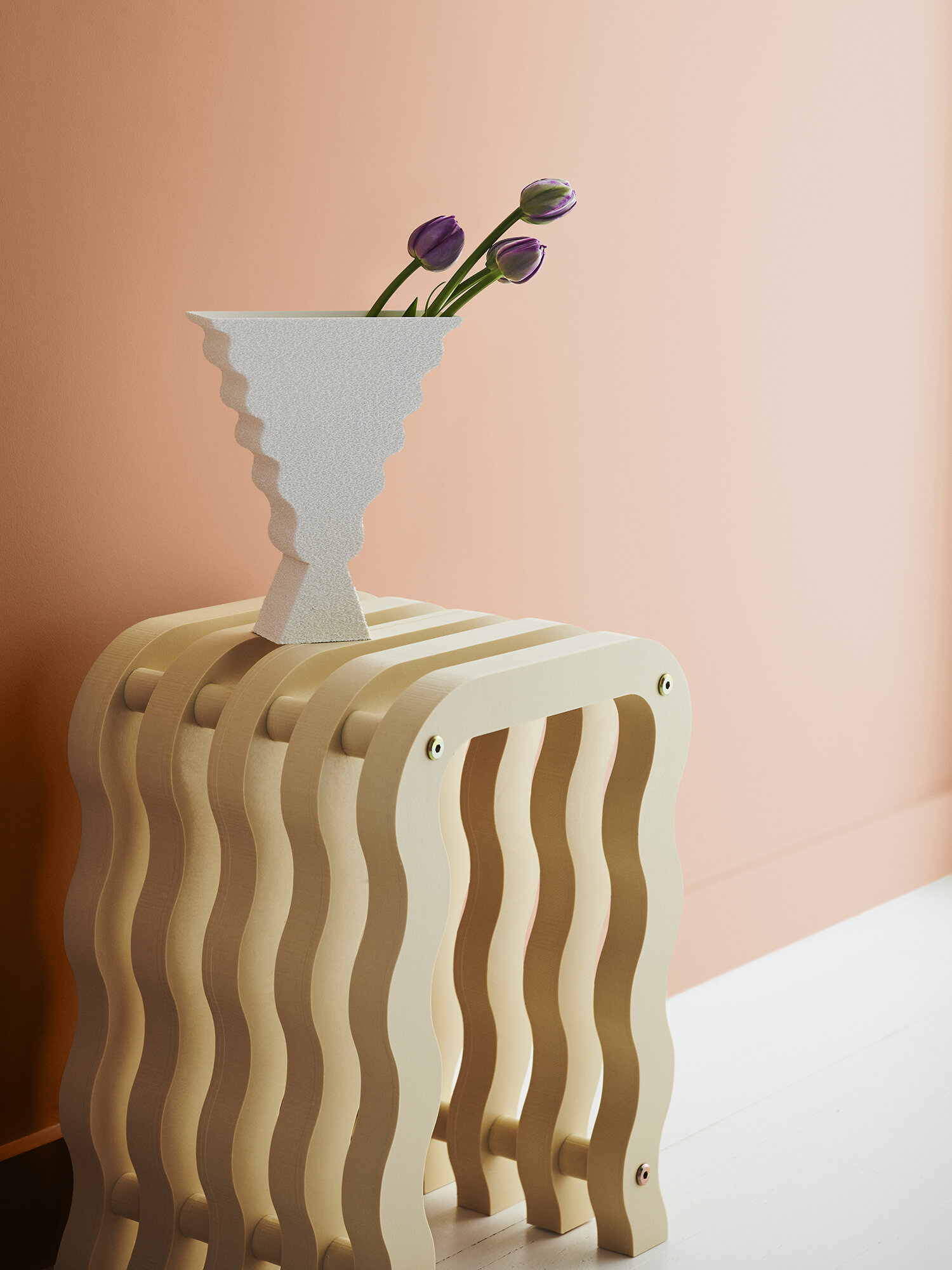
Left: Walls Dulux Sandpaper, ceiling and trim in Southern Alps, "White Waratah" Original Artwork by Cat Maddy.
Centre: Wall left Dulux Narrow Neck Half, wall right Natural Flora,"Cool Night, Bright Moon" by Peters Summers, Studio Gallery.
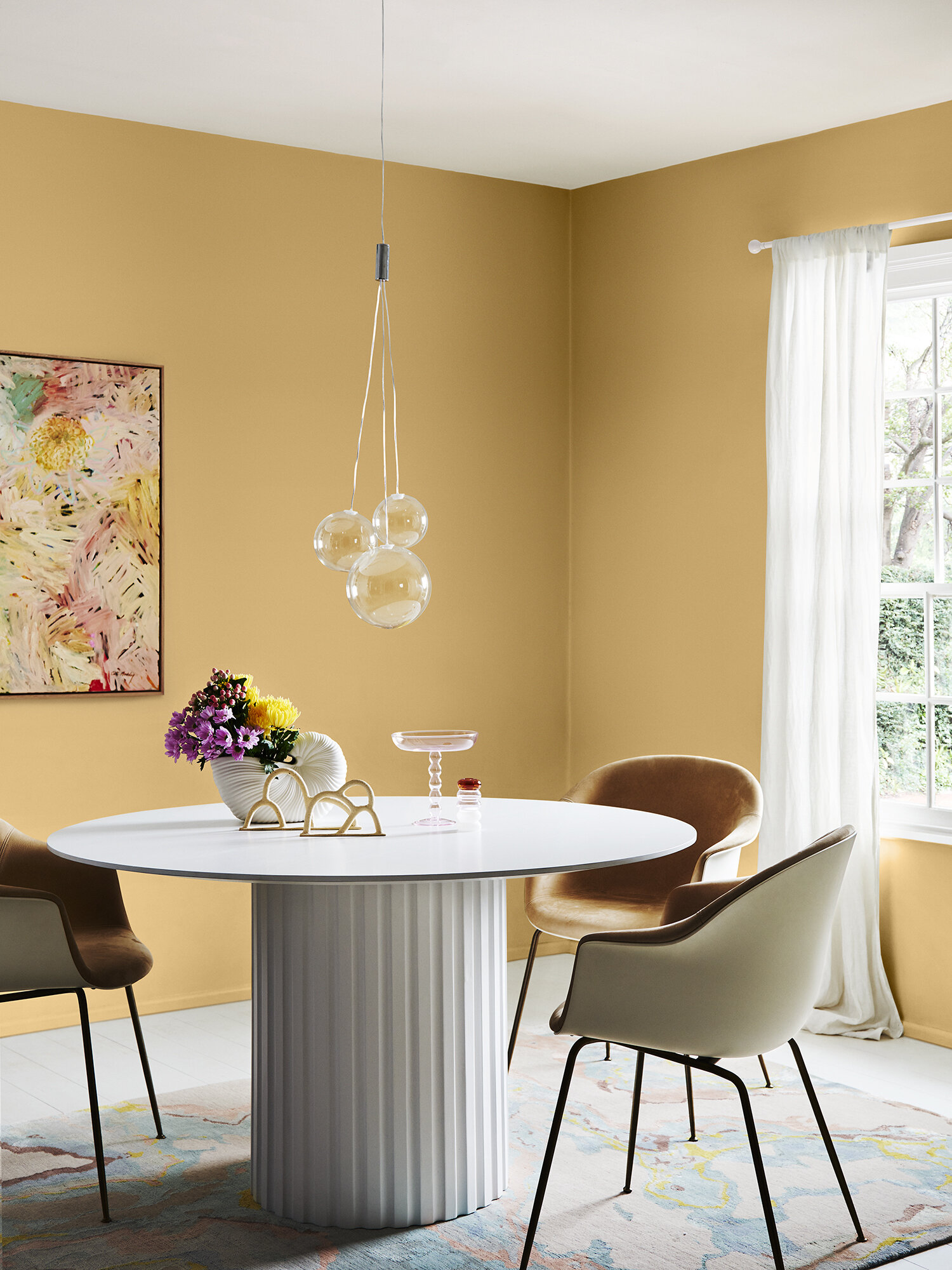
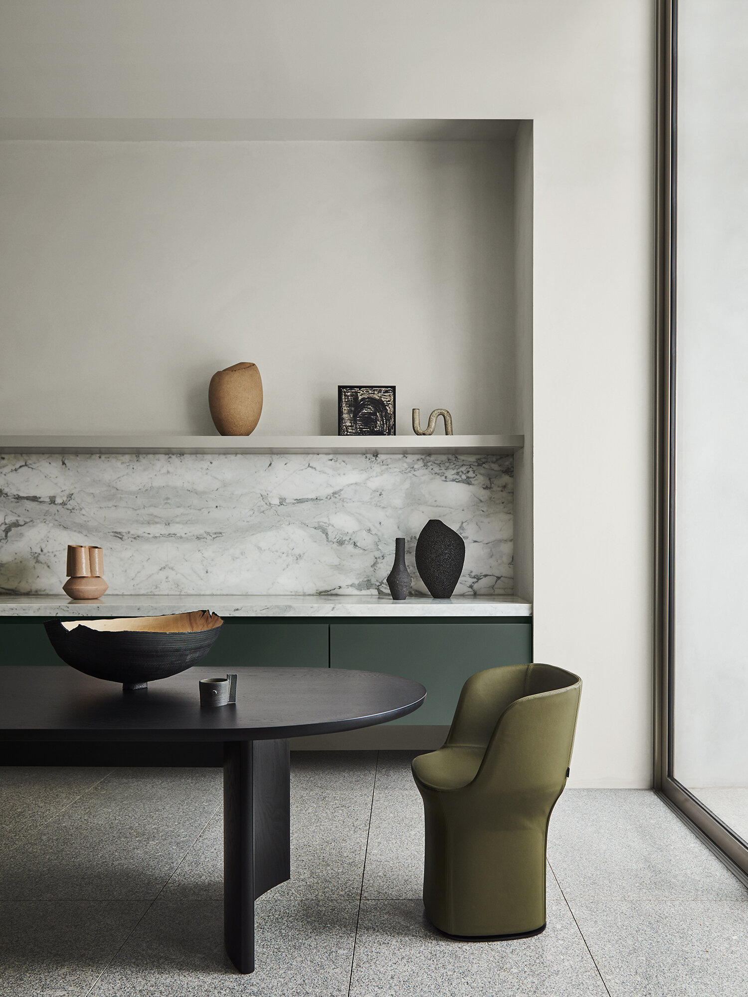
Right: Wall front Dulux Whāngārā, Wall back Pōhutu Geyser, trims & ceiling Sandfly Point Half, "Wild Flower" Original Artwork by Llewellyn Skye, Fenton and Fenton.
Looking at the three palettes Restore, Flourish and Wonder their personalities feel so different, where in recent years the palettes have felt more like siblings - this year they’re friends, marching to the beat of their own drum and unapologetically bold in their individual ways. The over-riding theme for me is FREEDOM, colour is a tool to create the life we want and need, and that looks different for everyone.
Can you tell how excited I am?
Let’s take a look at the palettes…
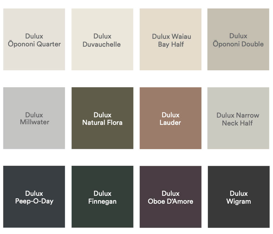
Restore
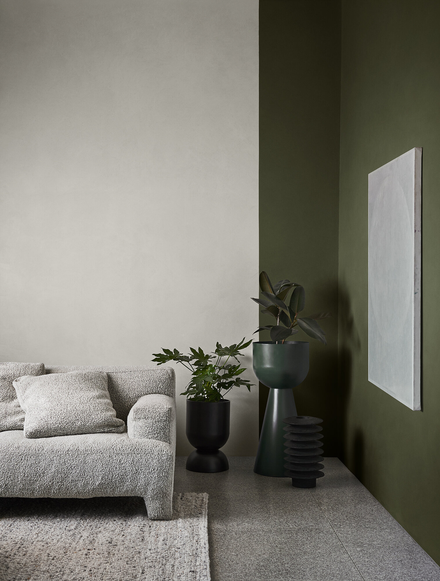
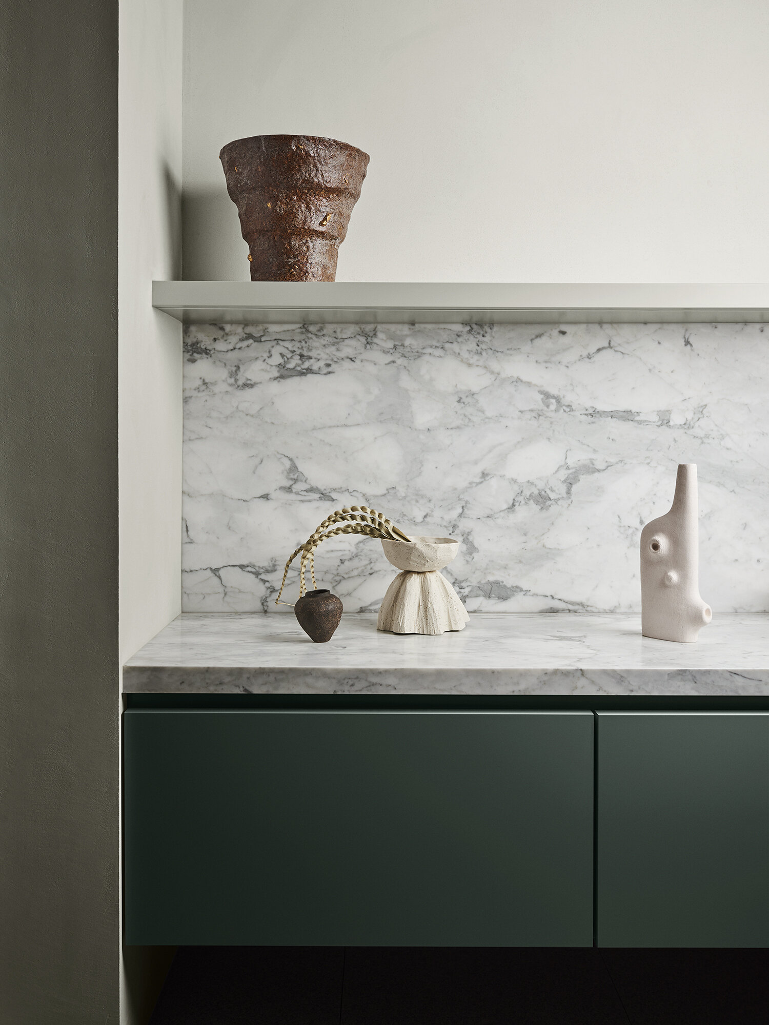
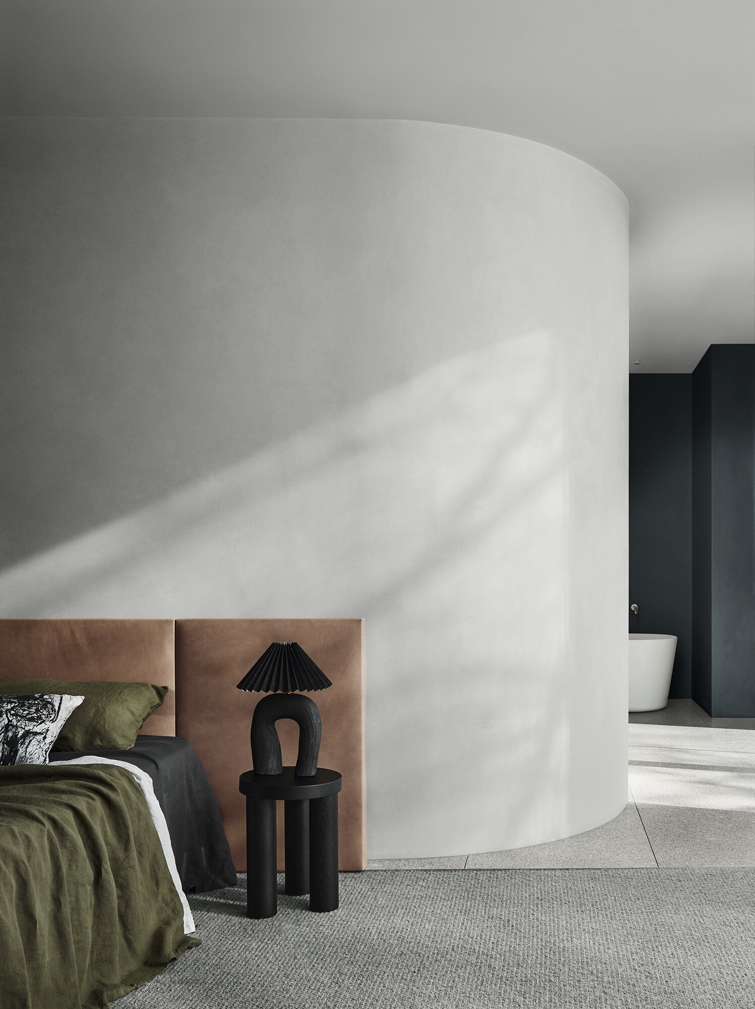
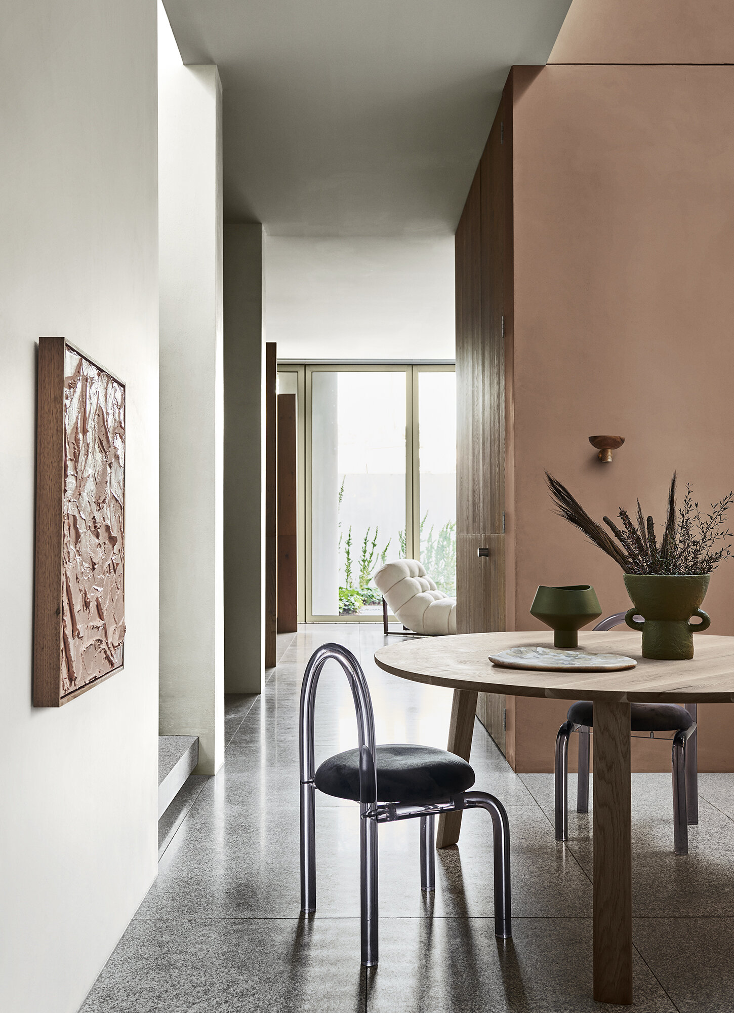
Restore is the earthy, neutral palette but with a solidity brought in by rich, deep, dark tones like Dulux Wigram (a dark warm grey) and Oboe D’Amore (darkest aubergine). Where in recent years neutral palettes were harder and shinier, here we can feel the texture and softness - more clay and sand, less travertine and marble. It’s incredibly sophisticated.
“This palette is inspired by our innate need for authentic connection and experience,” says Davina Harper. “Interiors have become our cocoon and a place where we can practice wellness and self-care rituals. We’re choosing less, however, focusing on more quality items that last and provide comfort above all else.”
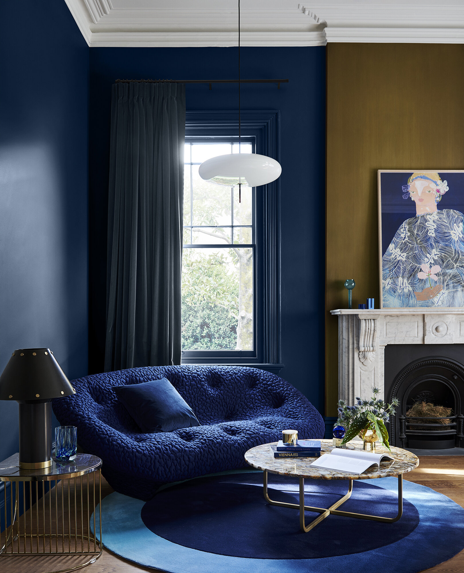
Left: Walls Dulux Ōpononi Quarter, joinery in Finnegan
Centre:Wall Front Millwater, Wall back Peep-O-Day
Right:Walls & ceiling left Dulux Duvauchelle, wall right Dulux Lauder, “Blushing Movements” Original Artwork by Felcity Lea
My favourite moments in this palette are most definitely the warm clay tone of Dulux Lauder, and the creamy Waiau Bay Half, but I love it all and I’m excited to see this more robust but gentle take on neutrals coming in.
Left: Walls Dulux Ōpononi Quarter, joinery in Finnegan
Right: Wall Dulux Lauder
Flourish
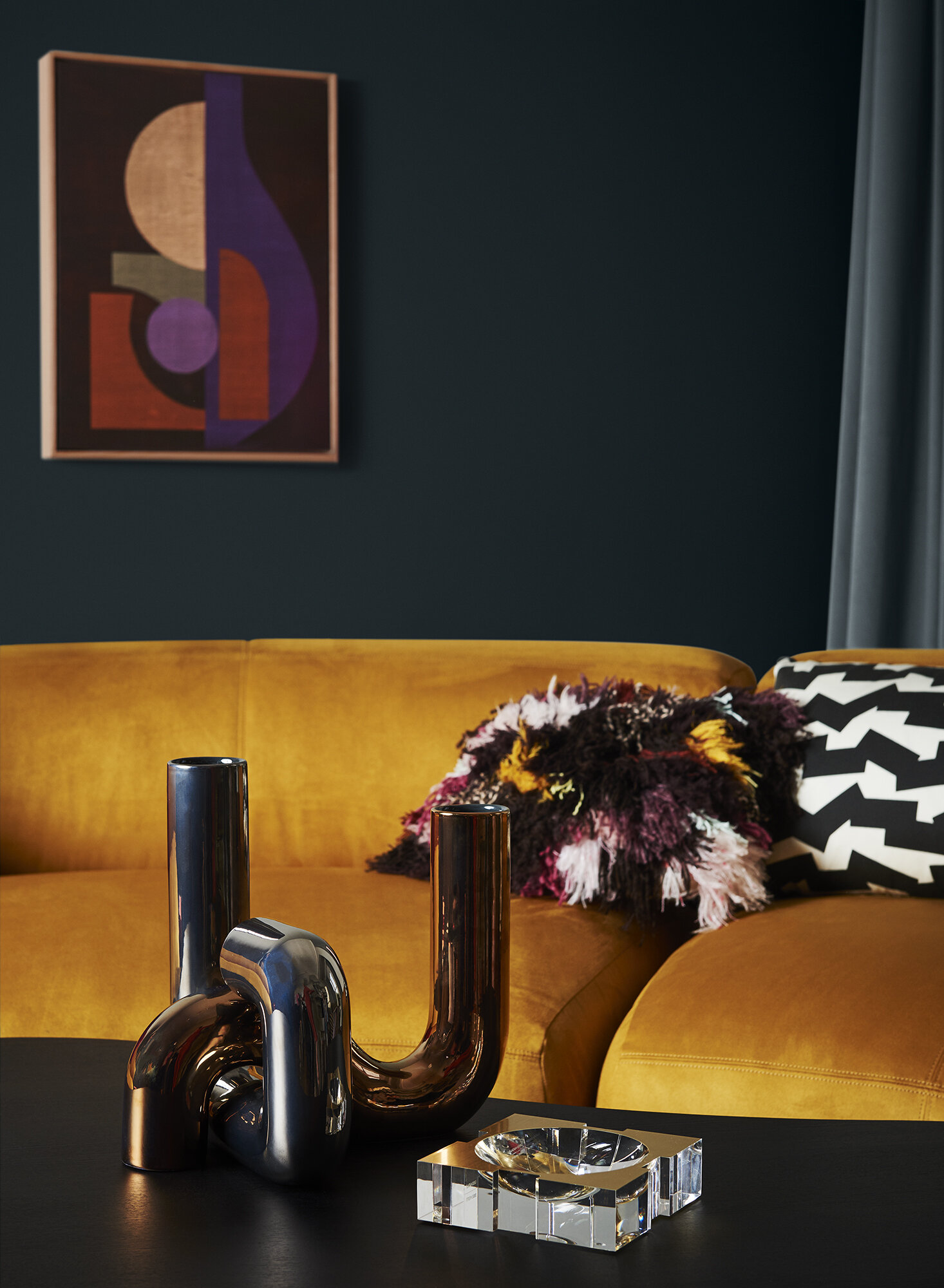
Wall Dulux Karori, “Together Talk” Original Artwork by Denise Hojdyssek, Fenton and Fenton
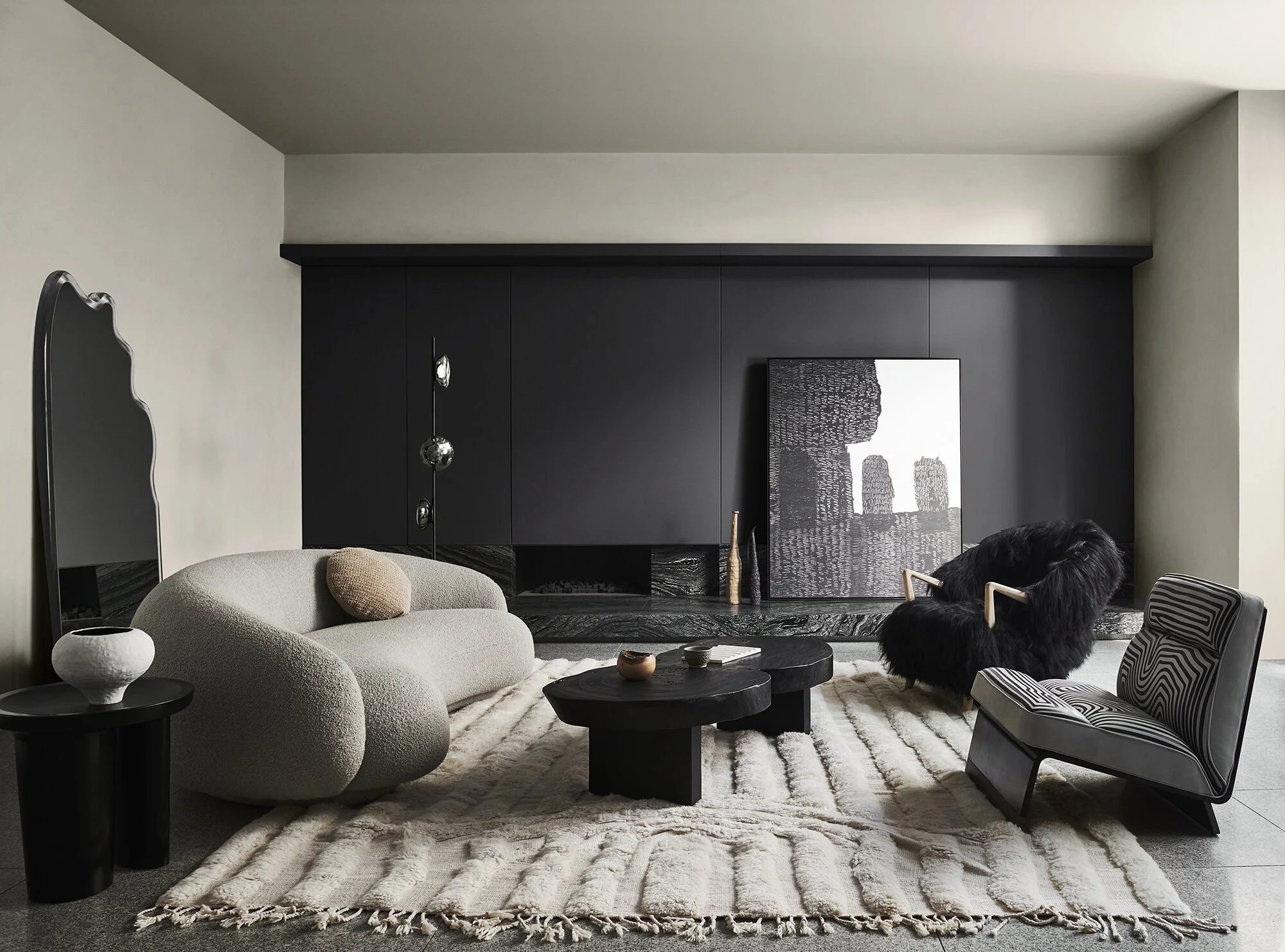
Flourish is unashamedly bold and brash, it’s decadent and showy. Seriously strong colours stand side by side in this palette where rules are made to be broken. There are so many ways to interpret this palette and create a mood, it’s an invitation to play and to layer.
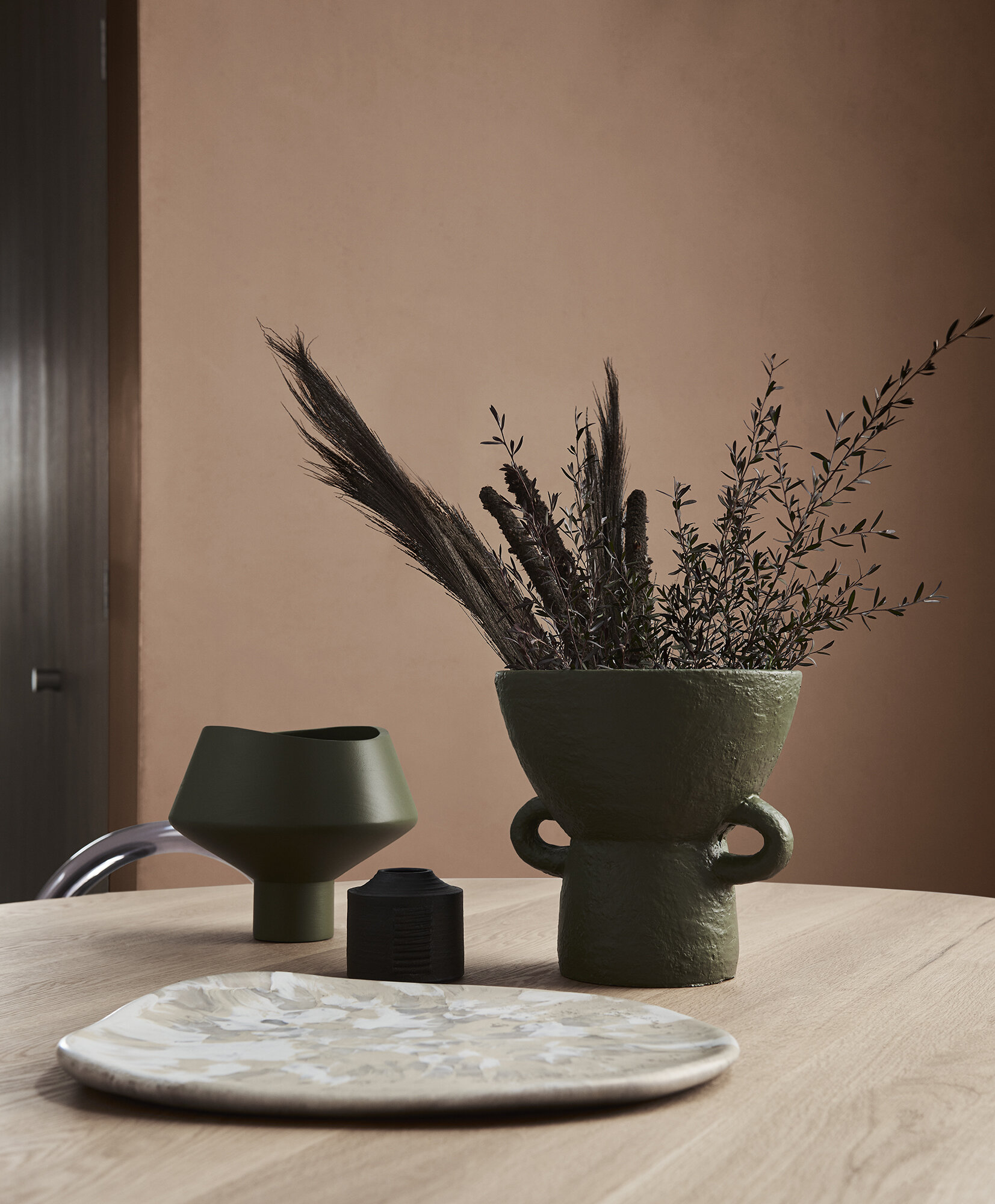
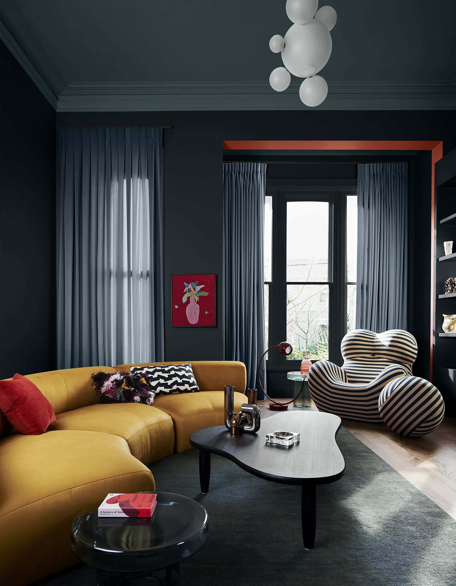
We haven’t seen as bold a colour as Dulux Coatesville, appear in trend forecasting for a really long time (of course my living room excluded 💁♀️) and for me this is the biggest pivot point. Coatesville is a deep, reddish-orange, red is such a significant colour in many cultures, in predominantly English speaking nations it mostly emerges in times of prosperity and confidence. This new orange-red, however is more of a “live and let live” adoption of a fantastic colour. It signifies the shift in our thinking around what matters and what makes us happy. It’s so far removed from the colder red kitchen splash backs of the late 90’s, and I’m thrilled to see it in there.
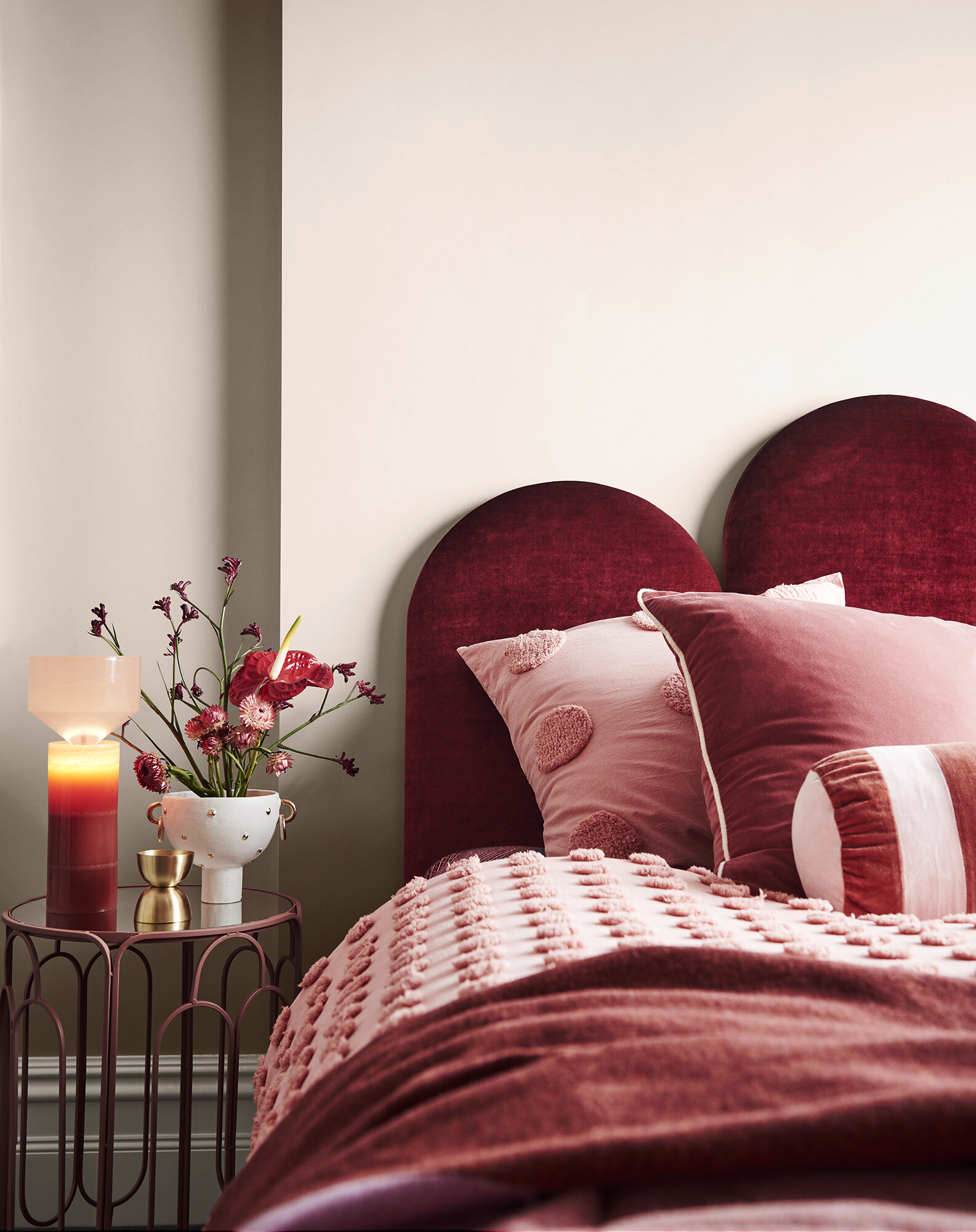
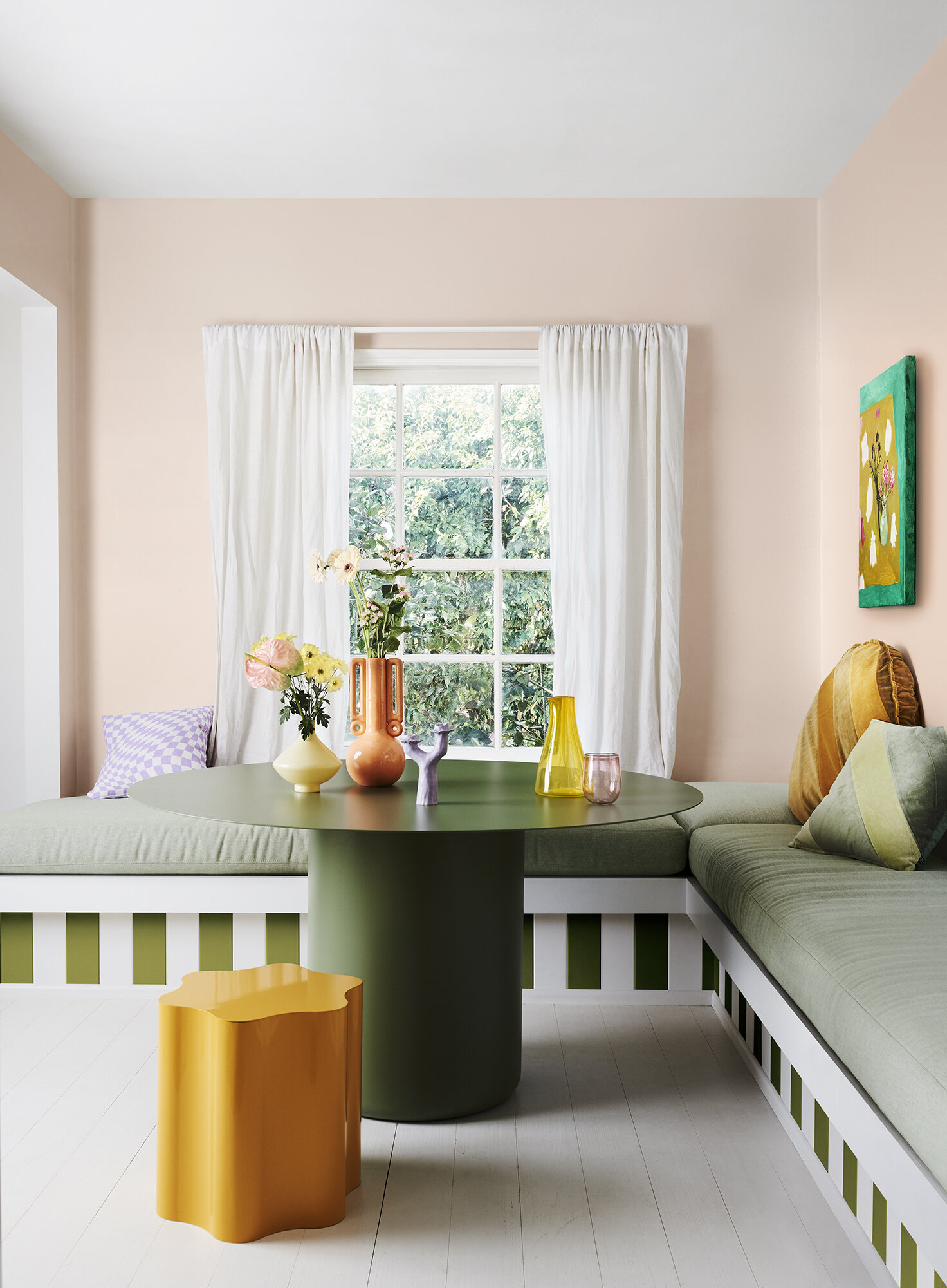
Left: Walls Dulux Basic Coral, Trims Sandfly Point Half
Centre: Walls & trim Dulux Browns Bay, Ceiling Sandfly Point Half, "Boudoir" Original Artwork by Diana Miller, Modern Times
Right: Wall Dulux Pōhutu Geyser
The Flourish palette works hand in hand with disco-era and deco style curved furniture, sumptuous textiles and eclectic approach to design. Metallics are a key component in this palette, think warm brass and gold finishes.
“It’s a look for those who want to re-write design rules,” says Harper. “As we move towards more freedoms, these colours enrich our feelings of empowerment and spark our imagination. With this comes unrestricted expression, inclusivity and a celebration of the diversity in our community.”
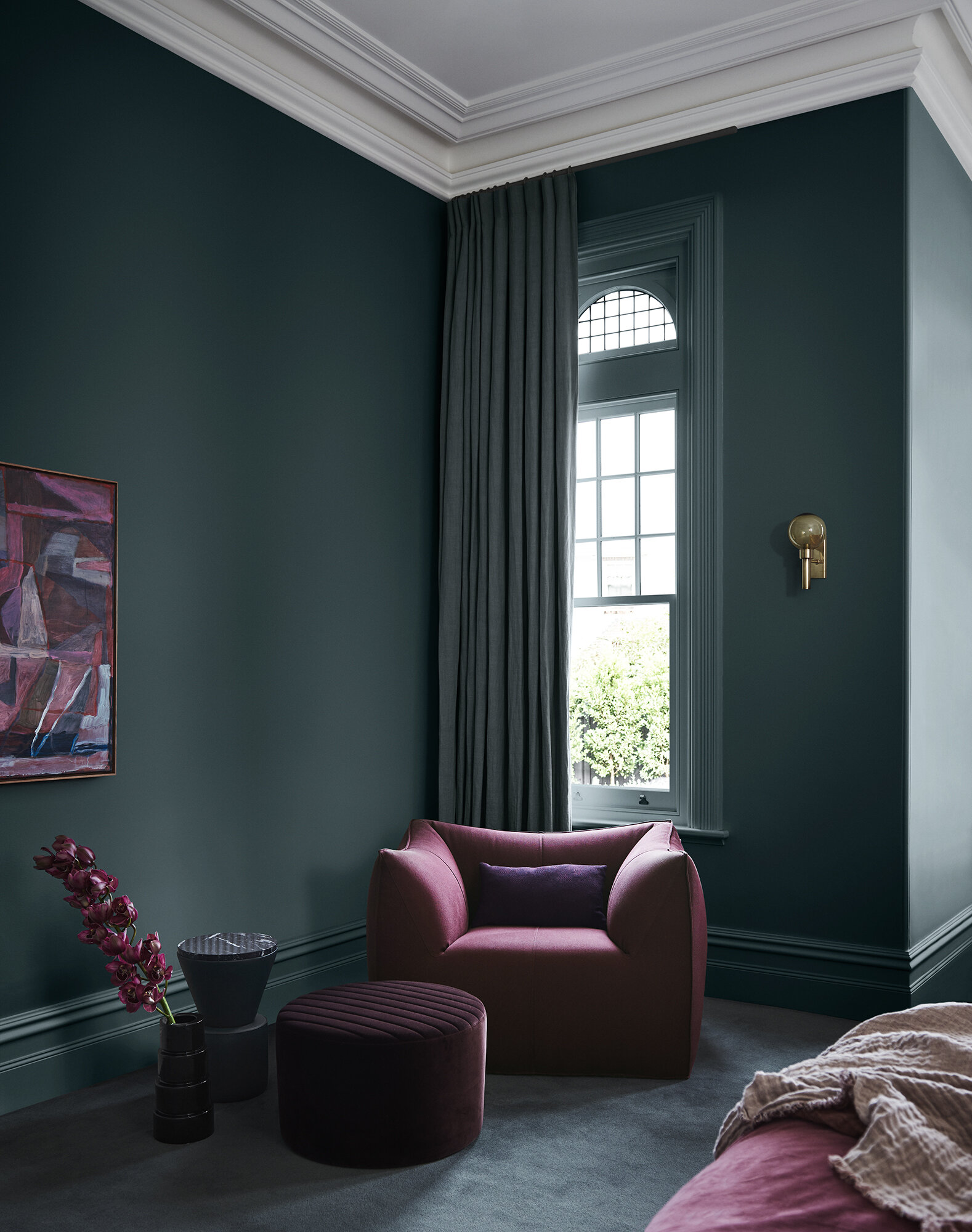
Left: Walls & trim Dulux Kenepuru Sound, Chimney breast Gold Vintage Gold Effect, Ceiling Sandfly Point Half, "Kimono" Limited Edition Print by Jai Vasicek, Fenton and Fenton.
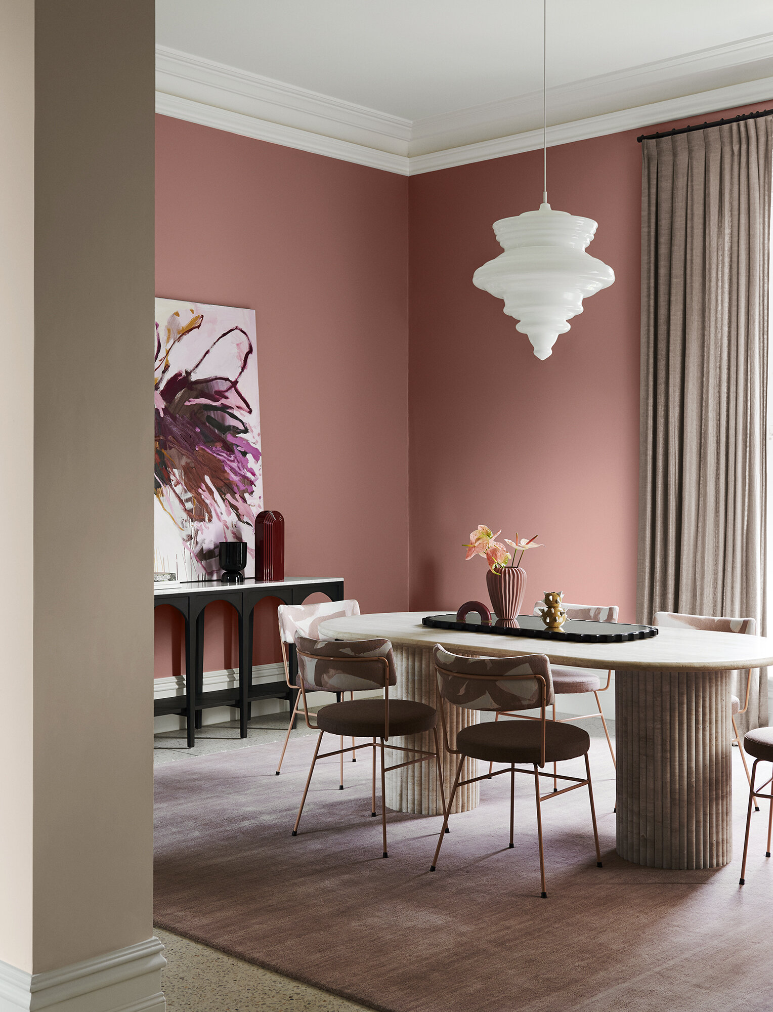
Right: Walls & trim Dulux Karori, Ceiling Browns Bay, Inside arch detail Coatesville,“Vase #1” Original Artwork by Jai Vasicek, Fenton and Fenton
Wonder

Walls Dulux Edvard, trims & ceiling Southern Alps, "Aeonium In A Posy With Kangaroo Paw and Paper Daisy” Original artwork by Dominka Keller, Forman Art and Framing;, " Lemons On A Pink Table” Original Artwork by Helen Mccullagh, Forman Art and Framing, "Green & Purple Freedom" Original Artwork by Brigita La, Modern Times
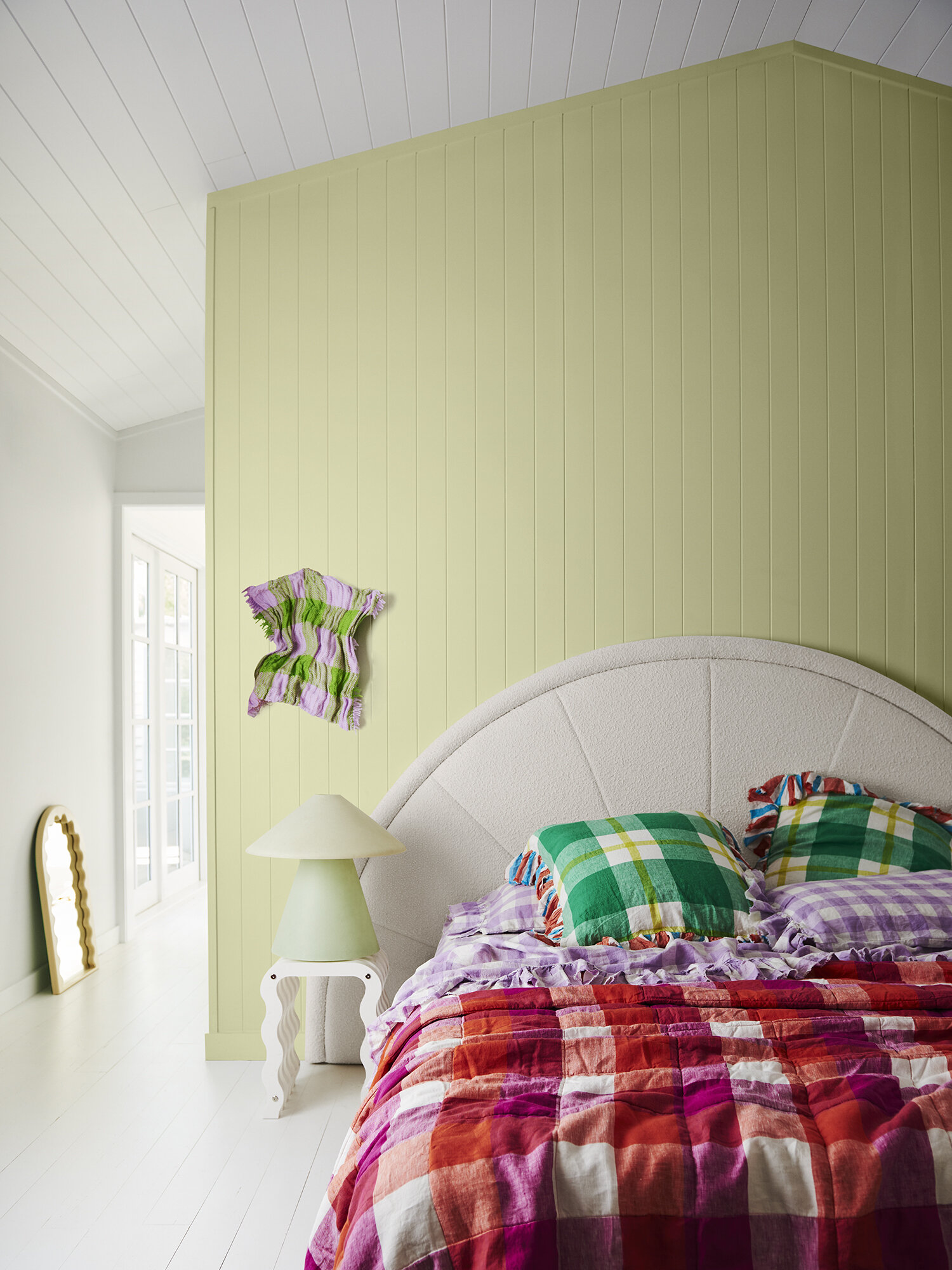
The final palette in this years Dulux colour forecast is the aptly named Wonder. A total, but wonderful surprise to me to see a palette so completely dedicated to fun, light, bright and rainbow hued pastels.
Wonder screams optimism, it is all those delicious 80’s ice-cream tones reinterpreted in to a completely modern palette - one we see in contemporary, indie design brands that take inspiration from their childhood. It’s in this grounding that it evokes sheer joy, and sentimentality. The world is a scary place right now, and this palette is a comfort and balm for that.
We no longer have to play it cool or pretend to be grown-up, instead we can dream and these carebear colours are just the ticket. “These colours set the stage for regeneration and growth, with unexpected tones drawn from the natural world around us,” saysHarper. “As we add more colour to our interiors, our imaginations are rekindled.”
Left: Walls Dulux Edvard
Centre: Wall left, ceiling & trims Dulux Southern Alps, Wall behind bed Dulux Mātauri Bay
Right: Wall Dulux Motueka
Wonder is very much a colour family I’ve used in my own kitchen makeove, and having lived with it for the last year I can completely understand the power these kind of colours can bring to a home.
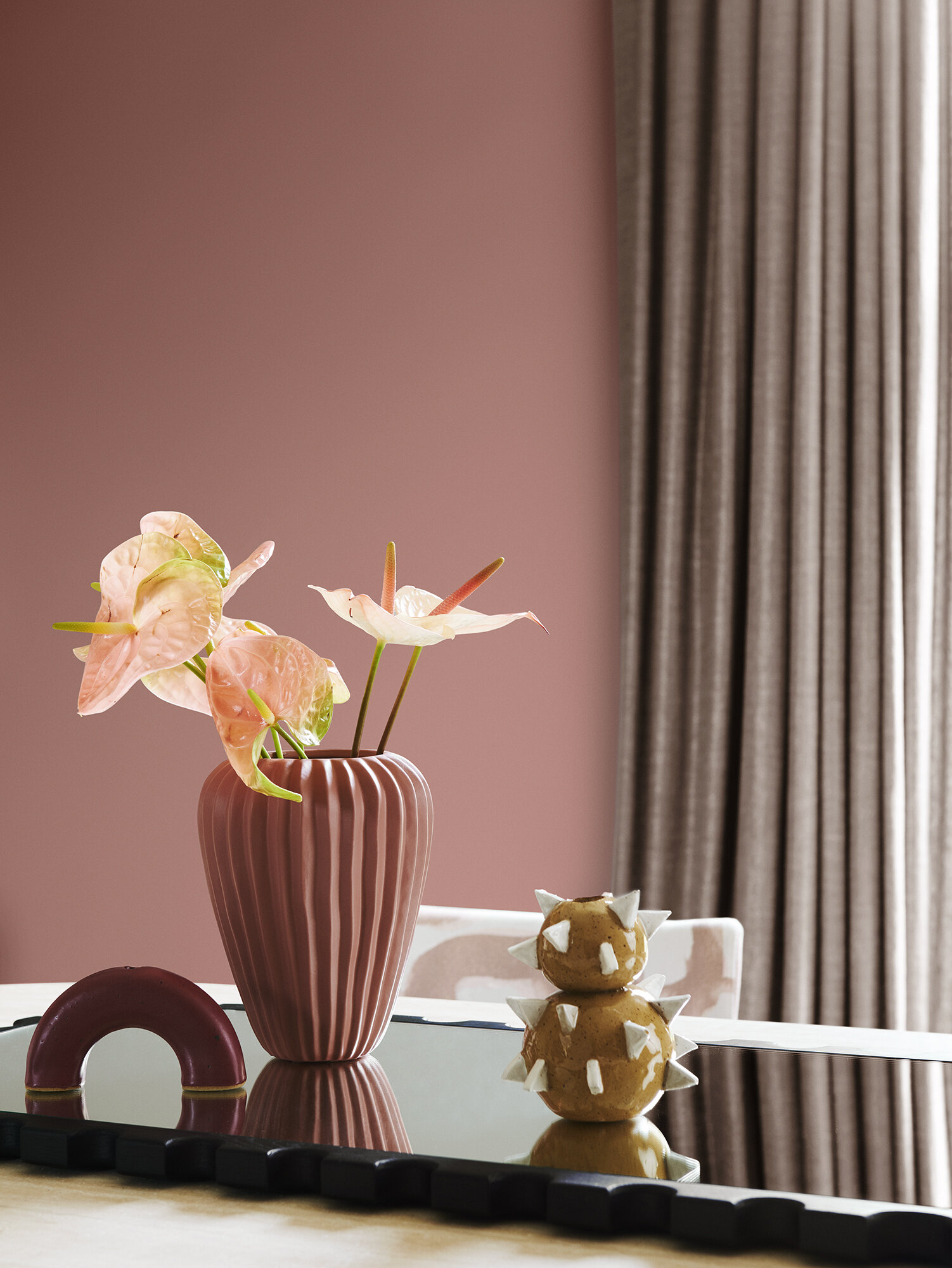
Some of my favourite colours here are Dulux Motueka (an orangey tan - the good kind), Dulux Tuakau (a dusty lilac, and my parents local) and Dulux Lakeside - very similar to Huka Falls, which I use a lot.
Left: Walls, trim and ceiling all Dulux Tuakau, "Empty Wishes" Original Artwork By Gabrielle Jones, Studio Gallery
Right: Walls Dulux Tītahi Bay, stripes Queenstown Hill, trim and ceiling Southern Alps, "Afternoon sun on the wildflowers” Original Artwork by Mandy Francis, Studio Gallery

Walls bottom Dulux Aratapu, Walls top & trim Southern Alps, Ceiling stripes Hagley Park.“Plant Spirit” Original Artwork by Studio of the Sun, Jardan