Filter: The Dulux 2019 Colour Forecast
The Dulux Colour Forecast is one of my very favourite design events of the year. It sounds unlikely, as so much of our experience of the world of paint is walking down the aisle at Bunnings and wistfully wondering if I can ever have a go with that paint mixer machine (just me? Doubt it).
But, the thing about Dulux, and why I'm always so excited and enthused to work with them, is that they go SO far beyond the basics of paint, and the research, thought and philosophy that goes in to each new direction blows my mind even more than the mixy machine itself.

Dulux Identity palette. Photo by Lisa Cohen, Styled by Bree Leech. Wall colour Dulux Tata Beach (rear) and Dulux Roxburgh (front). Artworks: ‘Mustard’ original painting by Stacey Rees, Modern Times (on wall), ‘Sculpture 13 ‘original sculpture by Mark Alsweiler, Modern Times (far right on ground).
Earlier this year, Davina Harper from Dulux NZ, and Stylist Bree Leech, travelled to the Milan Design Fair where they scrutinise design, colour, textures, movements, references, materials, styles, and shapes to formulate a four part (and palette) forecast of how interior trends can be interpreted by Dulux in the Southern Hemisphere (because we're unique flowers, and not just because we grow upside down).
This year, the forecast is "Filter", an interpretation of the way we're finding our way in the modern world, making choices about what we follow, and what we put in to the world. It's about taking the bombardment of technology and bringing it back to a more personal space. As soon as I read this I was nodding, I've felt such a shift in how we both consume and share our lives,a return to "self" (and not just selfies), and a step away from "peak popularity" (phew). But what does this mean in a design sense?
Dulux breaks this concept down in to 4 parts, each with their own colour palettes and design philosophies and influences, these four palettes are Repair, Wholeself, Legacy, and Identity.
“...‘Filter’ - something we all have to do in today’s busy world if we want to not only survive but nurture ourselves and thrive. Filter helps us to tap out of all the distractions and instead focus on things that move and inspire us.”
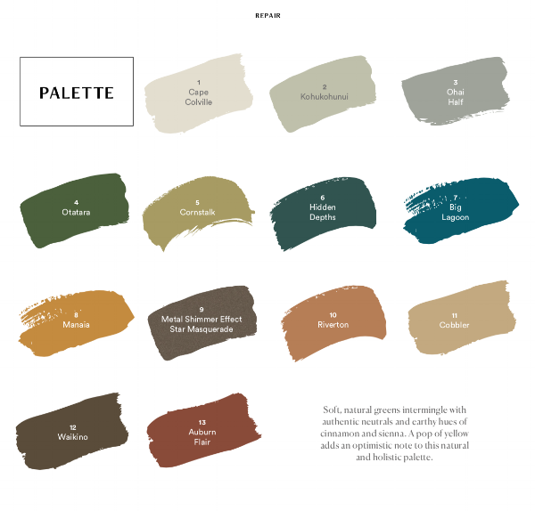
Repair

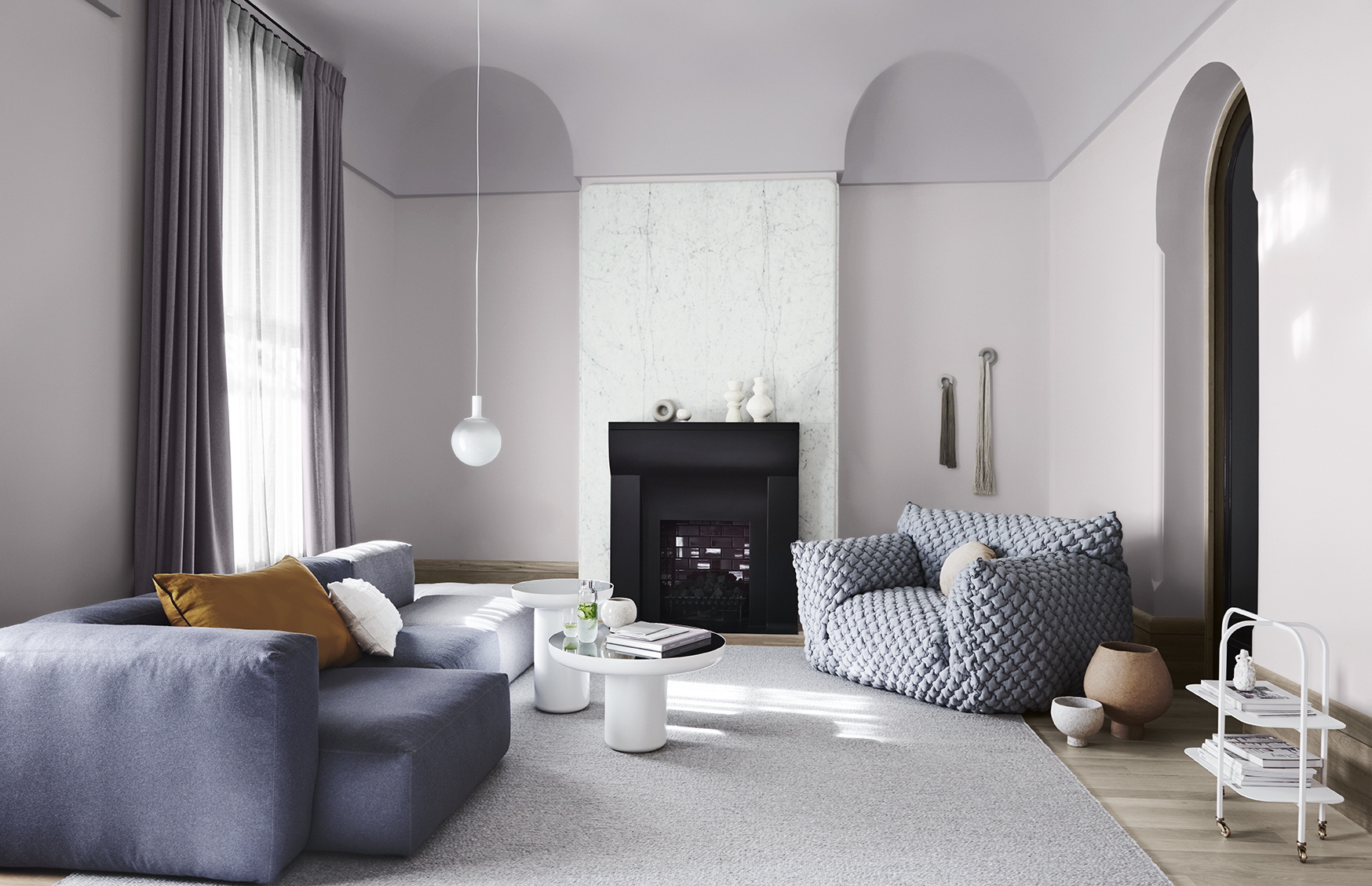
Repair palette Dulux Colour Forecast. Photo by Lisa Cohen, Styled by Bree Leech. Wall colour Dulux Otatara.
Repair is all about reconnecting ourselves with nature, in an authentic way. Repair is keeping it real - combining soft natural tones, with antique pieces, plenty of plants, hand crafted pieces. It's very tied to the Japanese art of Kintsugi (repairing ceramics with gold) which is a trend that featured heavily in Milan. I love this appreciation of the perfectly imperfect and of connecting ourselves with nature and history. The palette is just so perfectly the NZ landscape to me, earthy but rich, to be paired with raw timbers and handmade ceramics - no straight edges.


Repair Palette Dulux Colour Forecast. Stylist Bree Leech. Photographer Lisa Cohen. Wall colour Kohukohunui, ceiling in Cadrona. Artwork: ‘Vessel in Monochrome’ original artwork by Antoinette Ferwerda.

Repair Palette Dulux Colour Forecast. Stylist Bree Leech. Photographer Lisa Cohen. Wall colour Dulux Cobbler, with Cape Colville above brick, ceiling in Cardona, cabinets similar to Dulux Big Lagoon.
Wholeself
Wholeself Palette Dulux Colour Forecast. Stylist Bree Leech. Photographer Lisa Cohen. Wall colour Dulux Silver Thaw, ceiling in Dulux Milton.
Wholeself is the design equivalent of an artisanal pink clay face mask. It's a luxurious, quiet minimalism for when we need to take that step back from the busyness of modern life and spend a little more time being still. Soft dusky mauves, peachy pinks (Titahi Bay - such a cutie) create a palette that looks like a selection of exceptionally lovely handcreams, but then accentuated by a couple of great acidic tones to give it an edge, which I LOVE. I realised I've gone very "Wholeself" with my recently redecorated guest bedroom (which I still haven't photographed properly - sorry, will rectify that!).

Wholeself Palette Dulux Colour Forecast. Stylist Bree Leech. Photographer Lisa Cohen. Wall colour Dulux Shetland Lace Half, ceiling Dulux Titahi Bay. Artwork: ‘Ovoid II’ original artwork by Nick Horan, Hub Furniture


Wholeself Palette Dulux Colour Forecast. Stylist Bree Leech. Photographer Lisa Cohen. Wall colour Dulux Wainui Beach, ceiling in Dulux Cadrona. Artwork: ‘The Space in Between Trees’ original artwork by Kathryn Dolby, Modern Times.
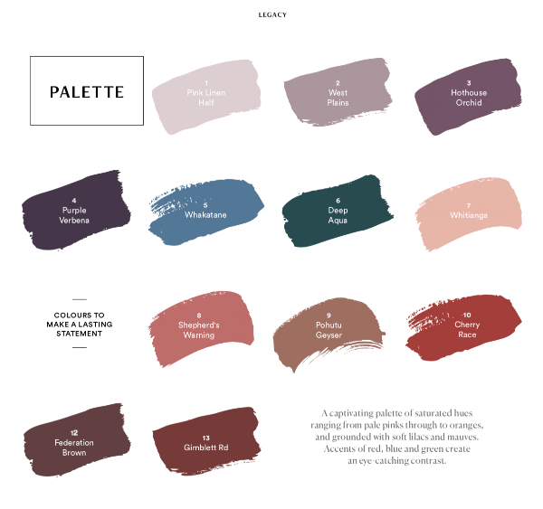
Legacy

Legacy Palette Dulux Colour Forecast. Stylist Bree Leech. Photographer Lisa Cohen.Wall (rear) in Dulux Shepherd’s Warning, console in Federation Brown, wall (right) in Pink Linen Half, ceiling & trims in St Clair quarter. Artwork: Orphelia Ritual One art print, Figgoscope Curates
"Legacy values the timeless and elegant over the new and disposable" - It incorporates classic trends with more modern styling in a sophisticated but bold palette. The influence of the strong and luxurious design eras of Art Deco and the 70's somehow combine effortlessly when presented against rich wall colours of deep purple, and deep smoky reds. Needless to say, this palette is one of my absolute favourites and seeing a return to the more dramatic and "heavy" design of those eras makes my heart sing.
Legacy Palette Dulux Colour Forecast. Stylist Bree Leech. Photographer Lisa Cohen. Wall in Dulux Whakatane. Artwork: ‘Sometimes Left Wanting’ original artwork by Helen McCullagh, Fenton & Fenton

Legacy Palette Dulux Colour Forecast. Stylist Bree Leech. Photographer Lisa Cohen. Wall (front) in Dulux West Plains, wall (rear) in Purple Verbena, ceiling in St Clair Quarter.
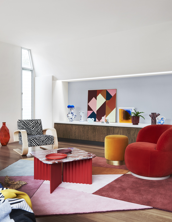
Identity
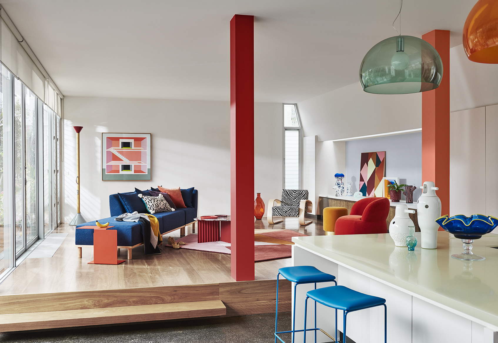
Identity Palette Dulux Colour Forecast. Stylist Bree Leech. Photographer Lisa Cohen. Walls in Dulux Southern Alps, feature wall (right) in Dulux Massey, column (left) in Devil's Staircase, column (right) in Sunbird Orange. Artworks from left: ‘This Life We Share’ original artwork, by Jasmine Mansbridge, Fenton & Fenton, 'Untitled no.23’ original artwork by Max Lawrence White, Modern Times, ‘Blue Savana’ original artwork by Mim Fanning, Studio Gallery.
Identity is the final of the four palettes, and is described by Bree and Davina as almost the "anti trend", it's about cancelling out what others are doing and marching to the beat of your own drum. It's about using strong, personality filled colours and combining them in ways that are unique to you. Identity has a lot of the 1980's design references we started to see last year, pattern clashing, grids, strong black and white accents, and of course bright, almost primary, colours. Interestingly, for this palette, some of the wall colours are quite light and almost neutral, allowing the accents to pop! I've done my own mini makeover inspired by Identity which I'll be sharing soon (and it might be a giveaway situation too, just saying).

Identity Palette Dulux Colour Forecast. Stylist Bree Leech. Photographer Lisa Cohen. Wall (left) in Dulux Southern Alps, wall (feature) in Dulux Manapouri and Dulux Taylor's Mistake, stair wall in Dulux Waiheke. Artwork: ‘A Portion For Foxes’ original painting by Stacey Rees, Modern Times.

Identity Palette Dulux Colour Forecast. Stylist Bree Leech. Photographer Lisa Cohen. Wall (left) in Dulux Southern Alps, wall (feature) in Dulux Massey. Artwork from left on sideboard: ‘Untitled no.23’ original artwork by Max Lawrence White, Modern Times, ‘Blue Savana’ original artwork by Mim Fanning, Studio Gallery.
I've only really touched the surface of everything that goes in to the Dulux Colour Forecast, so I highly recommend having a flick through the beautiful e-magazine here. I'd love to know if you're inspired to try something new based on these trends and I'm always happy to give my opinions too (understatement!), and I'd also love to know which is your favourite palette?
All images are taken by Lisa Cohen, styled by Bree Leech for Dulux NZ/AUS.